

Why these unsightly monkeys?
Six thoughts about designing simply
Happy Monday! What better way to start your week than the words of a 13th century Cistercian abbot complaining about the gargoyles in his monastery:
In the sight of the reading monks, what is the point of such ridiculous monstrosity?… Why these unsightly monkeys, why these fierce lions… and strange shapes everywhere, so that we may prefer to read the marbles rather than the books?
Bernard de Clarivaux, from his Apologia ad Guillelmum Abbatem, ~1215 CE
Like Bernard, I have been thinking a lot about simplicity lately. Partly because it is my job. But also because it is one of those topics that gets stranger the longer that you think about it. Not least because it can mean so many different things. Throughout the centuries people have felt very differently about things that appear simple. Whilst a Cistercian monk may have approved of the clean lines of a 21st century Apple product, the average Victorian would have gazed in genuine pity and horror at the poverty of decorative elements on each milled aluminum surface.

Simplicity has always been a vessel into which we have poured contemporary hopes and anxieties. To a Cistercian monk its lack of distraction allowed one to get closer to God. To a Neo-classicist like John Soane it carried an antique dignity and grandeur. To an early modernist like Adolf Loos—who famously quipped that “Ornament is crime”—it was part of a moral obligation to escape the cycles of decorative fashion.
Our present-day conception is throughly mid-20th-century, forged in the plastic moulds of Braun products and the typographic ideas of the Swiss School. In our speeding and chaotic 21st century simplicity has become a refuge from the complicated world around us. Digital designers like me also value simplicity simply because it just works™️. If you want somebody (or better yet lots and lots of people) to understand and use something you’ve designed, then you give yourself the best chance by making it as simple as possible.
And yet, when you do sit down to design something simple, which sounds like it should be the easiest kind of thing to do, it is striking how perversely difficult it can be. What begins as a simple-sounding idea accrues baggage and complication on the drawing board or Figma canvas, making the process of reaching simplicity one of endlessly taking stock, of stepping back, bringing in others or at times keeping them well away. Stranger still are the psychological barriers that prevent us from reaching a simple design, which I find that we don’t talk about enough.
For this week’s essay then, I’ve put together six thoughts about what makes designing simply so difficult, along with some ideas for to work through, or around these challenges. Whatever you’re designing this week, and whatever unsightly monkeys 🐒 you are attempting to purge from your own work, I hope these ideas give you some new ways of tackling the challenge. Genuine simplicity is elusive, but always worth going the extra mile for.
We lack a good definition of ‘simple’
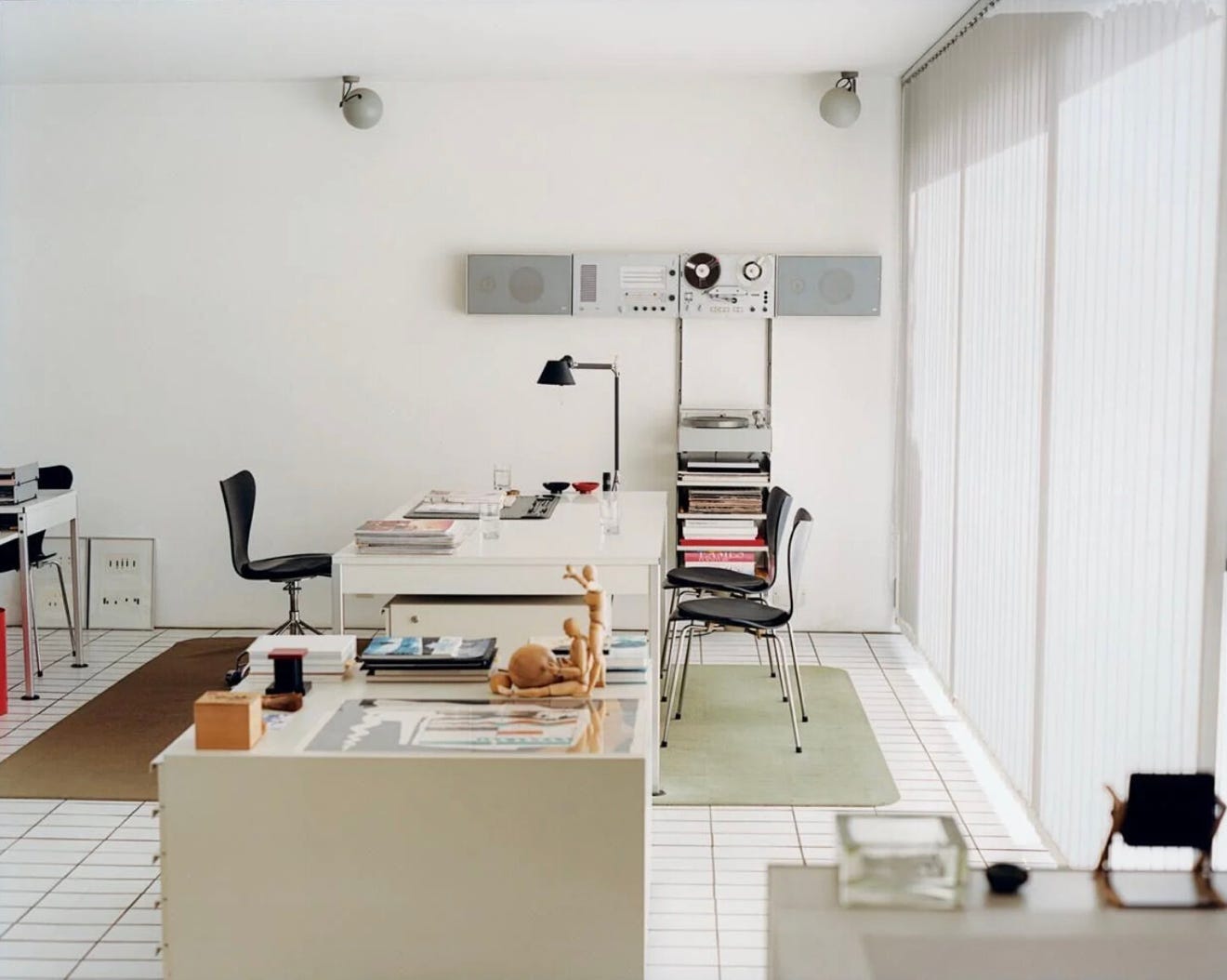
Frankly, I have always found interiors of the home which Dieter Rams designed for himself a little forbidding. Whilst they are filled with objects of his own design that are individually exemplary, collectively the impression is rather austere and strange.
The truth is that we’re not used to being around quite so much simplicity. In fact, we are surrounded by objects, systems and environments that seem to grow more complicated by the day. Simple designs like a Dieter Rams record player or a Shibui tea bowl are rare islands in a vast sea of confusion. This matters because it sets our expectations. When everything you encounter is muddled and confusing, it’s hard to break the mould.
Which brings me back around to Rams’ house in Kronberg. You simply could not bring a complicated object into that space without it sticking out like a sore thumb. The environment itself is a sort of machine for maintaining a high bar of simplicity.
I am not encouraging you to live exactly like the Ram’s but I do believe it’s important to cultivate a personal library of things that set an equivalent bar. Things that are simple, or simply nice. When we have a benchmark against which we can compare our own work, it’s much more easy to see if we are being truly simple.
We’re missing the perspective of others

When you overuse a word, the meaning can drain out it until it’s just an empty set of syllables that signifies nothing. Something similar can happen whilst designing. We become so familiar with the artefacts in front of us that we paradoxically lose touch with them and can no longer see them for what they truly are. And when you’ve lost touch with the thing, it’s easy for complexity to creep in unnoticed.
There are a few different ways out of this dilemma, the simplest is just to go for a long walk or try to forget about the work for a few hours. My favourite way though is through other people. When you show your work to those how have not seen it before you can suddenly see it like its new again. They see things you didn’t notice or stumble over something you thought was obvious. Through their eyes you can suddenly see what it will really take to make the thing feel simple.
Whether this is through formal research activities or simply sharing your work in progress with a non-designer colleague who sits next to you in the office doesn’t really matter. Like brushing your teeth, the practice of regularly sharing your work is a reliable way to keep complexity at bay.
We get too hung up on the perspective of others
But before you get too comfortable, leaning too heavily on others can also be a trap. The difficult truth is that complicated designs can emerge organically from a series of entirely reasonable-sounding incremental decisions. If we are only a butler for the ideas of others and lose sight of our original vision and intent, then sooner or later we’ll be staring at our design and wondering how it got so complicated.
Many of you working in larger companies will have seen this process play out many times. A round robin of earnestly sought feedback and helpful suggestions mutating a project into a Frankenstein, heavy with too many incompatible ideas and suddenly something that nobody wants at all.
There is a sweet spot. To refresh our understanding through other people whilst at the same time staying true to fundamentals that we (and only we) define. To be simple, we must learn which suggestions to act on, and which to politely ignore. I could probably write an entire separate essay on how to exercise this judgement, but the core of it is knowing what really matters and what is incidental. This is the work you really can’t delegate. More on that in the next section.

Enjoying Design Lobster? Share it with a friend, colleague or fellow designer 🤲🦞
We don’t understand what matters well enough
No one knows whether the famous line—I was going to write you a shorter letter but I ran out of time—should be attributed to Mark Twain, Blais Pascal or Goethe. Whoever it was, they were also providing an important design lesson, as well as a writing one.
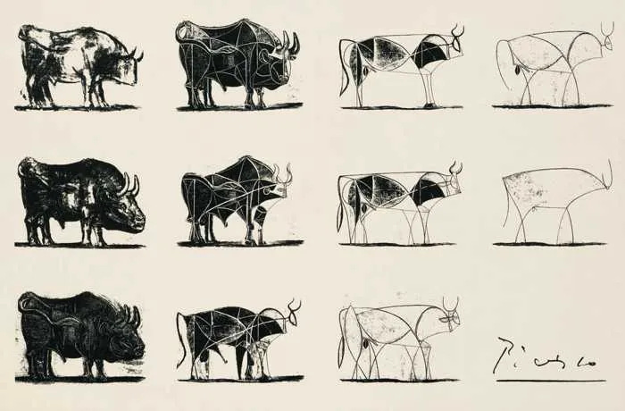
Simple designs are a short letter, not a long one. They distill a few important ideas to their essence and resist the urge to elaborate beyond that. In some ways the design process is a business of finding out what those few important ideas really are and working out how to bring them alone to their fullest expression. Restraint, which in past essays I’ve argued is close to the essence of design, emerges through a process of refinement. You start with something baggier and looser and progressively sharpen based on what you learn about the problem and spectrum of possible solutions that are available to you.
If your design doesn’t feel simple to you, it’s very likely that you haven’t yet found the most important questions to ask. Once you know those and can apply them to your design, complexity and cruft slide away like meat from a bone. More often than not this process plays out messily, with a project needed to pass through its own Baroque period before you figure out what you can take away and reach something elegant.
We’re overthinking it
Now we come to the more curious group of psychological barriers that can present themselves when trying to be simple. On the whole, we designers are a compassionate bunch and are at pains to show our thought and care in the work we do. And mostly this tendency is beneficial, allowing us to empathise deeply with the people we’re designing for, the details of their lives and the problems they are facing.
However there is a dark side to all this care, and it can manifest as an overeagerness to pin down every last corner of a design in an attempt to eliminate any possible way it might be misconstrued. To over-describe and annotate the margins of the letter to let ourselves feel that we’ve done everything we possible could to come across in the way we wanted.
It’s true that simple designs can sometimes seem a little austere, almost callous at times. But there is a moment towards the end of any project when we should lean into this side of the design (and ourselves) a little more. To take a deep breath and have faith that the person who encounters our creation will get it without us fussing over them. It takes trust, both in them and in the work you have done up to that point, but it’s an essential, if unnerving, component of achieving simplicity.
We’re a little bit scared
When you’re forced to be simple, you’re forced to face the real problem. When you can’t deliver ornament, you have to deliver substance.
—Paul Graham
I’ve left this one until last both because it’s important and little uncomfortable to talk about. The unpalatable truth is that simple design leaves no room to hide mistakes or unclear thinking. Whereas complexity can mask inadequacies, simplicity highlights those very same imperfections.
In some settings, this can create a perverse incentive against presenting work that is too simple out of fear for somehow being exposed. It can be psychologically easier to show lots of work and lots of things, to wave your hands and distract so that the penetrating glare of stakeholders (or whoever is on your Crit panel) is distracted from engaging with a core idea that you maybe fear deep-down isn’t as solid as you originally believed.
The only advice I have to embrace the discomfort as early as possible. As long as this exposure comes early enough in the design process it is your friend, helping you to get to where you need to go. It’s only when it comes too late that it becomes problematic. Dare yourself to face the music early, and you might be surprised at how well things come together later.
Everything should be made as simple as possible, but not simpler.
—attr. to Albert Einstein
I feel compelled to add as a postscript that simplicity should never be the only quality we aim for when designing. There is such a thing as too simple. Other qualities, like personality, warmth and good old usefulness matter too, sometimes as much or even more. What always remains true though is that any feeling, any intent you’re trying to communicate through your design will always be more easily heard if the thing as a whole feels simple. With any design project I think it can be helpful (if a little scary) to remember that we just have one shot at delivering a message, and we give that message the best (and maybe only) chance of landing if it’s not drowned out or obscured by too much stuff.
Anyway thanks for reading this edition of Design Lobster. I hope you banish some monkeys this week,
Ben 🦞
Enjoyed this essay? Let me know by clicking the heart button.
👇
This made me think about the debate with prehistoric art: the first rock art (animals) is very detailed and realistic, and then there is a period when everything is drawn with just 4 or 5 lines, very basic representations of people and animals. It puzzles archeologists, like artists went ‘backwards’. But I think is the other way around: reducing a concept to the simplest representation possible is not easier- it is way more difficult. It’s abstract thinking at its best.
I find it fascinating how these principles apply to my own field of music, especially when it comes to arranging parts for a song. Over the last couple of years I’ve moved from more complex (even orchestral) arrangements to much simpler guitar-piano-voice approaches.
There’s a technique in audio mixing, where you turn the level down so that you only hear the “core” of the sound, which is where the simplicity lives. All the tiny details disappear until you turn it back up. It gives perspective.
(Also, thanks for the MacOS screenshots you posted recently - a wave of nostalgia!)