#97 Design: a map
Bias, tactility and more... 🗺
Join Design Lobster #97 on a cartographic expedition. This week we’re asking why the world looks the way it does on conventional maps and admiring a very unusual example of Inuit map-making. 🧭
✨Enjoying Design Lobster? Please share it with a friend, colleague or fellow designer.
Question: How should we map the world?
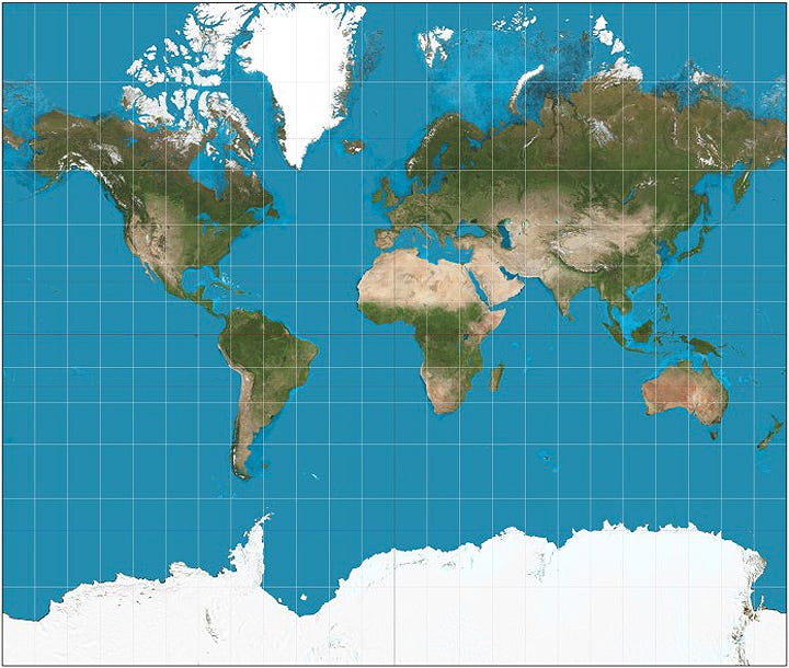
In 1569 the Flemish cartographer Gerardus Mercator published a new kind of map that was designed to make sea navigation easier. A Mercator projection maps directly onto compass bearings without requiring any adjustments which means a navigator only needs to stay true to their compass to arrive at their intended destination.
The map achieved this by projecting the spherical surface of the world onto a cylindrical shape, but the side-effect of this method is to vastly magnify the polar regions of the world and diminish the true scale of the equatorial areas. The best of illustration of this is Greenland, which seems roughly the same size as the continent of Africa, but is in fact 14x smaller!
This distortion has ended up serving political ends over the centuries, increasing the visual prominence of the northern Colonial powers at the expense of the countries which formed their empires. The choice to centre the map around Europe (and the UK in particular) gives these countries even greater prominence. These inherent biases led to an entirely different type of projection being used in the design of the UN Flag, founded as it was on the principles of co-operation between equal nations.

The story of the Mercator Projection shows the power of design to shape our mental models for how the world works (and looks). As designers, we should stay aware of the ways the representations we make can reflect our own bias, as much as the reality they purport to show.
Design takeaway: How is the way you are mapping reality affecting the designs you create?
🗺 This website lets you compare the true sizes of countries and shows how dramatically the Mercator distorts some.
Object: Ammassalik Wooden Map
The Danish explorer Gustav Holm commissioned these remarkable driftwood objects from the Tunumiit people of Eastern Greenland in the 1880s. Each one is carved to represent a different part of the Greenland coast, with the central thinner example representing an island chain and the squatter one to the right a coastline. The notches and grooves form a tactile diagram of the landscape and would have been used like a map by Holm to navigate the territory. Unlike paper maps they do not use cardinal directions and are designed to be read (or felt) in a continuous loop, up one side and down the other. In this sense they are more like the record of a journey than a map.
I love the way the way these objects stretch my definition of what a map can be and I find the idea of navigating solely by touch a fascinating provocation. It’s important to note however that these wooden tools were made for sale and not part of an indigenous tradition. The Tunumiit people knew the landscape they lived in so well they had little use for maps or navigational aids.
Thanks to reader Vuokko for telling me about these maps!
Design takeaway: How are you translating reality into the form of your design?
❄️Learn how to design an igloo
Quote: “The real voyage of discovery consists not in seeking new landscapes, but in having new eyes.”
– Marcel Proust
My long-time readers will have heard me banging on again and again about the importance of keeping our vision of the world fresh when we design. Forgive me for making the same point again today with this quote from Proust!
May you see things with new eyes this week,
Ben 🦞
Enjoyed this week’s Design Lobster? Let me know by clicking the heart button.
👇


