Design Lobster #88 brings you stories of adaptable design. From Google’s latest Android software to a iconic lamp from the 1970’s. This week it’s all about you 💅
Also, I’m very excited to share that this week’s edition is sponsored by Storyteller Tactics: A Card Deck of Story Recipes.
Become a more influential UX designer
Even the best designers are bottlenecked by one skill: storytelling. If you can't convince stakeholders, you lose. So, we've put the best story tactics together to help you skyrocket your UX career. Learn more here →
Question: How might we make interfaces feel personalised?

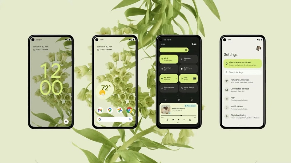
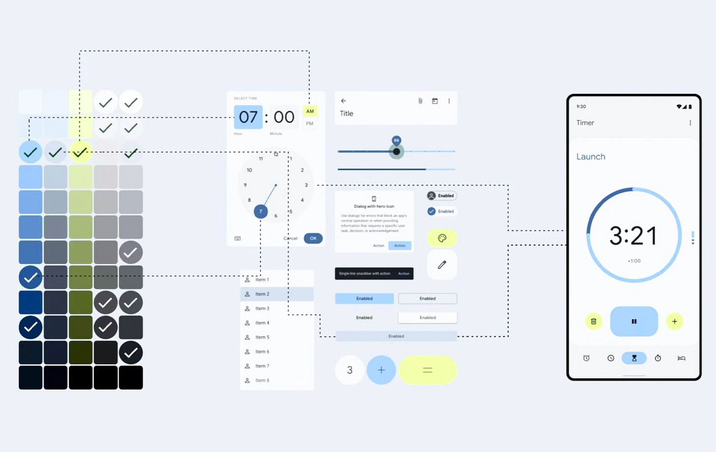
At their I/O Developer Conference in May this year, Google unveiled an update to their Material design language that set out to make the Android interface look and feel much more personalised. Named Material You, one of the key ways the new software achieves this goal is by adapting system colours according to the wallpaper selected by the user. As shown in the diagram below, Material You is able to identify appropriate dominant and secondary colours, as well as a whole host of tints from a single photo and then apply these intelligently across the entire UI.
For me, Material You raises a number of fascinating philosophical questions, including how we think about the role of design and designers in a world that adapts to individual tastes. Rather than imposing their unique vision on the world, it seems to me that designers might have to adopt a more flexible pose, finding ways (like this colour-picking system) to allow individuals to contribute to the end result.
The latest update began rolling out this month and I’m intrigued to see how it performs in the wild 👀
Design takeaway: Are there places where your design could feel more personalised?
🔴 Design Lobster #76 explored the biology behind certain UI colour choices
Object: Tizio Lamp

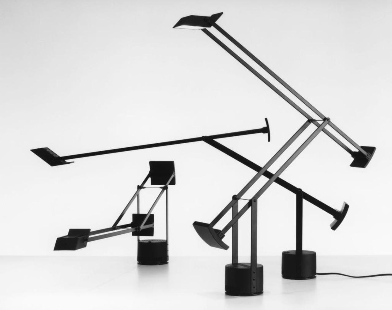
Richard Sapper’s design for this work lamp was reportedly borne out of his own frustration at the lack of suitable options for his own desk. He wanted a light that was easily adjustable but that didn’t have to be clamped down, but couldn’t find one that satisfied him. His design for the 1971 Tizio for Artemide, can be adjusted using an elegant system of aluminium arms with counterweights, which work to ensure stability across a wide range of positions, as shown above. Unusually, the lamp’s arms also conduct electricity eliminating the need for further wires and keeping the design extremely clean.
In Sapper’s trademark black and red accents, the lamp became a must-have addition to many an executive desk – where it projected high-tech sophistication and a kind of rational cool. It won a Compasso d’Oro in 1979 and brought Sapper to the attention of IBM, where he worked for many years on products including the original ThinkPad.
Design takeaway: Could you make configuring your design such a delight?
▶️ Watch a 1983 documentary about Richard Sapper
Quote: “Design is partly about form giving, but it’s also about asking questions. It’s about observing behaviors, and then trying to synthesize all of those things into a process or an object or a system or an interface. The reason that design is interesting and important is that it keeps reconfiguring itself and it keeps being about different things.”
– Deyan Sudjic, writer and former Director of the Design Museum
Deyan Sudjic reminds us in this quote that the discipline of design itself is always reconfiguring too. Just when you think you know what it’s about, along comes a new technology or way of working that redefines the discipline’s boundaries.
Have a great week,
Ben 🦞
Enjoyed this week’s Design Lobster? Let me know by clicking the heart button.
👇


