It’s Design Lobster #73 and we’re exploring designs that have celebrated the constraints imposed upon them. From the Sardinian houses of architect Alberto Ponis, to the graphic design of Willem Sandberg, made whilst a WWII fugitive.
✨Enjoying Design Lobster? Please share it with a friend, colleague or fellow designer.
Question: How should you build a house on a cliff?
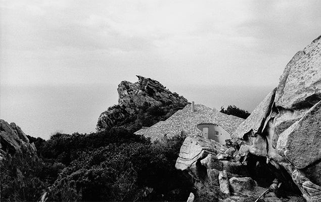
This week, whilst dreaming of a foreign holiday that (alas) is unlikely to happen this year, I was reminded of the extraordinary Sardinian houses of the architect Alberto Ponis. Across forty years, he built over two hundred houses on Sardinia, mostly on the so-called Costa Paradiso on the island’s northern coast. This coast is rugged, marked by rocky outcrops and steep cliffs and though beautiful, is certainly not the most obvious place to build.
Alberto’s architecture is strikingly accommodating of this unforgiving terrain. His houses are modelled on local farmhouses known as Stazza, but adapt their forms wildly to the more vertiginous landscape they find themselves in. Casa Hartley, shown in the photo above drapes itself as a huge pan-tiled triangle over the landscape, accommodating boulders and even existing plants within its plan. In other houses, irregularly-shaped pools are accessed by steps cut directly into the rock.
Ponis would map his houses out on their site using stakes and string, often seeking the most challenging place to build on a given site. There’s something about his perverse attraction to the hardest constraints that I find really inspiring.
Design takeaway: Should your design yield more to its context?
✍️ Check out some more photos and drawings of Casa Hartley.
Object: Experimenta Typographica
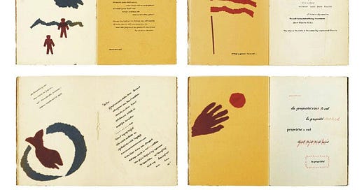
Willem Sandberg was Director of the Stedelijk Museum in Amsterdam from 1945 to 1962, but before this he was a member of the Dutch Resistance helping Jewish refugees escape the Nazi Occupation by forging identity papers. After a Resistance plan to burn down the Amsterdam Central Record Office failed, he had to go into hiding for the last years of the war.
To keep himself going in this time, he created a series of short books of about twenty to sixty pages known as the Experimenta Typographica. They mostly consisted of quotes from his favourite designers and philosophers, which he would illustrate with whatever he had to hand, mostly torn scraps of coloured paper. As shown above, the material economy, combined with his strong sense of composition, resulted in some unexpectedly delightful pieces of design.
Design takeaway: How would your design change if you could only work with a few materials?
🖼 Listen to a talk by Rick Poyner about Willem Sandberg.
Quote: “[Constraints are] one of the few effective keys to the design problem.”
– Charles Eames
We last heard a quote from the Eames’ in Design Lobster #47. This week something rather short and pithy from them. Charles argues that instead of thinking of constraints as well, constraints, and trying to ignore them, we should be running towards them. Directly addressing these limits brings us to solutions that are more surprising, elegant and specific to the situation at hand.
Whatever you do, keep celebrating those constraints.
Ben 🦞
Enjoyed this week’s Design Lobster? Let me know by clicking the heart button.
👇


