For this edition of Design Lobster, we’re exploring the theme of ageing in design. From computers designed to age gracefully, to a lightbulb that has burned for more than a century. A celebration of all things retro, past-it or has-been! 💾
✨Enjoying Design Lobster? Please share it with a friend, colleague or fellow designer.
Question: Why were computers all beige?
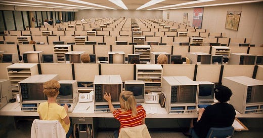
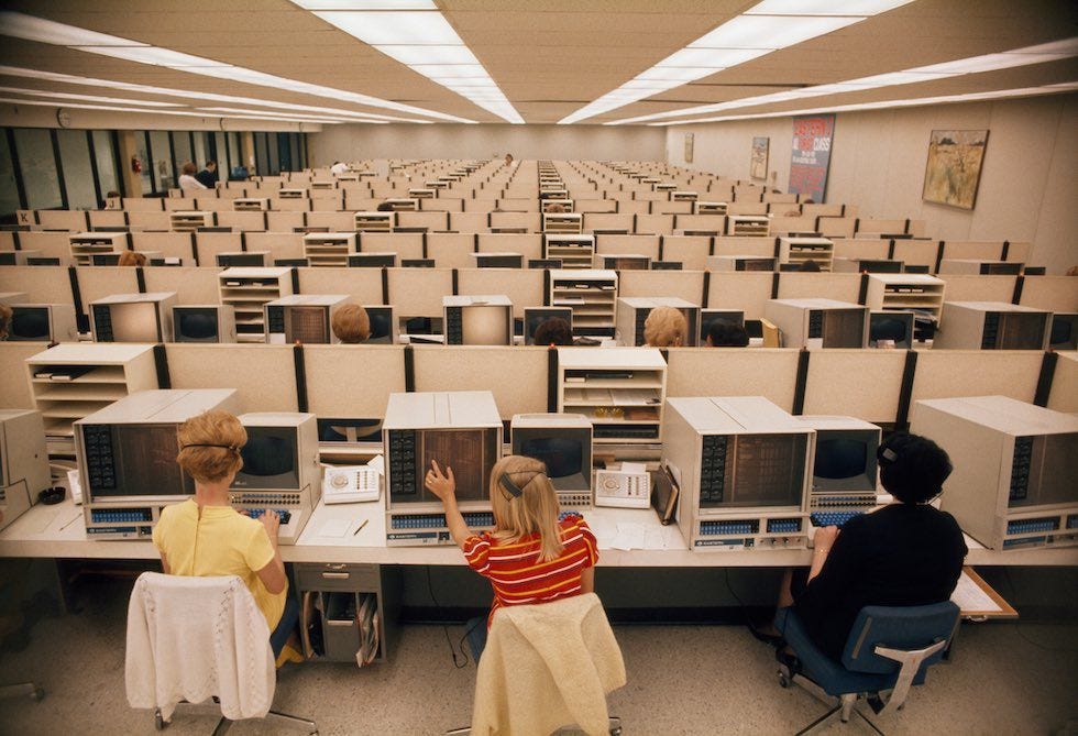
When I was a child and wanted to use a computer, I would go down to the office where my parents worked at the bottom of the garden. Inside, an enormous beige cathode ray monitor would confront me and to turn it on I’d scrabble for the power button located on the huge (and equally beige) tower underneath the desk. After a few seconds warming up, the screen would crackle into life and after the agonisingly slow boot up process I could get on and play Lemmings or whatever game I was obsessed with at the time.
Nowadays, we don’t see much of the colour, but beige used to define computing. In the 80s and 90s when most computer purchases were by organisations rather than individuals, the colour was an agreeably bland addition to the sludgy hues fashionable in office design in that moment. Black plastic was felt to be too intimidating and white had the problem of showing up dirt or discolouration over time. Beige, in this sense, offered a readymade vintage look. Computers in this colour never looked too new or too old. You could almost say they looked timeless.
In 2021, silver has probably displaced beige as the go-to colour for computer casings, reflecting a market oriented towards consumers that need to be impressed with the shiniest and newest thing to open their wallet. But with concerns about the environmental impact of e-waste on the rise I reckon beige is overdue a comeback as the most sustainable hue of all.
Design takeaway: How will your design age over time?
🗂I enjoyed this compilation of PC commercials from the 80s.
Object: The Centennial Light
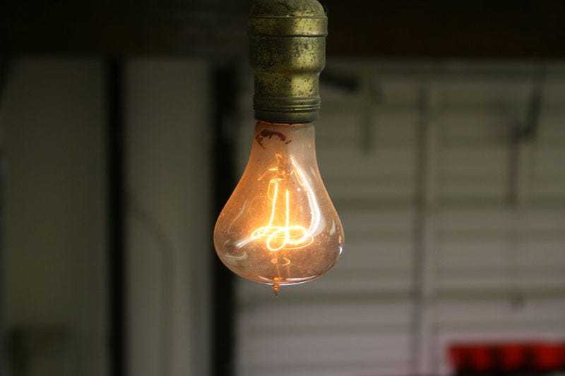
In 1901, the bulb above was switched on, and barring one or two outages from power cuts or moves, it has shone ever since. To this day it has never blown. In its 120 years of operation it has racked up well over 1 million hours of light, which is 1000x a typical incandescent bulb and 20x even an LED. Across the century the bulb – known as the Centennial Light – has lived at five different locations. Currently it resides at 4550 East Avenue in Livermore, California and is maintained by the local Fire Department.
The secret to the bulb’s longevity lies in its design. It uses hand-pulled carbon filaments which last much longer than the tungsten ones that are more commonly associated with bulbs. In the early days of electricity when it was a luxury good, companies were responsible for the entire system, lightbulbs and all, so it was in their interests to use long-lasting bulbs.
All that changed as electricity became a mass-market product. It came to light in the late 20th century that the so-called Phoebus cartel of major manufacturers had conspired to fix the lifespan of a bulb at 1,000 hours in 1924 in order to ensure repeat purchases and maximise profits. This early example of planned obsolescence is reported to have held back improvements in lightbulb efficiency by decades.
Design takeaway: Could you make your design last a century?
💡 Don’t worry, there’s a webcam trained on the bulb 24/7 - check it out.
Quote: “Human nature hasn’t changed for a million years. It won’t even change in the next million years. Only the superficial things have changed.
It is fashionable to talk about the changing man. A communicator must be concerned with the unchanging man – what compulsions drive him, what instincts dominate his every action, even though his language too often camouflages what really motivates him.”
– Bill Bernbach
This quote, from Bill Bernbach – Creative Director and and founder of Doyle Dane Bernbach – is addressed to ‘communicators’ but I think it could apply just as well to designers. It’s the things about people that don’t change that are most important when designing. Great design reaches deep.
Whatever you do, keep discovering.
Ben 🦞
Enjoyed this week’s Design Lobster? Let me know by clicking the heart button.
👇


I wanted to know, so I had a search and found this piece: https://retrocomputing.stackexchange.com/questions/14314/why-were-most-pcs-and-electronics-beige-back-in-the-day
TL;DR: beige is neutral and matches most things. It was also common for office equipment and home furnishings at the time. More stylish equipment requires a preference on the part of the buyer, so “less stylish” is easy for anyone to buy.