It’s a new week which means an all new Design Lobster! Today we are discussing what designers might mean when they talk about “taste”. Plus a trip to Suffolk, England to admire some fabulously curvy walls. Dive in! 😋
This issue also marks the first anniversary of Design Lobster(!) 🎂 – to celebrate I’d like to point you to a couple of my favourite newsletters from the past year:
#24 Visualising racism, slipper adverts & relationships
#7 Non-human design, chindogu & veneers
…oh, and don’t forget, Design Lobster is on instagram.
Question: What do designers mean when they say “taste”?
I’ve been reading Ken Kocienda’s book Creative Selection about his time at Apple in the 2000’s working on the software that powered the original iPhone and iPad. The whole book is well worth a read but I was particularly struck by a section near the end where he discusses the word taste in the context of design.
Ken characterises taste as the ability to form opinions with your gut that you can also justify with your head. Building this takes time and practice however:
“Studying great work from the past provides the means of comparison and contrast and lets us tap into the the collective creativity of previous generations…
…When I study the past, I make a point of deciding what I like and sometimes this this built-up catalog of refined-like responses about past works finds a suitable outlet and a natural expression in my present-day work.”
Taste is, of course, an idea that tends to inspire controversy. Associated with elitism and snobbery, the concept can play into a characterisation of the design industry as a priesthood, handing down arcane or secret knowledge from master to tutor with little regard for those beyond the temple walls.
So I think it’s refreshing to see the way Ken reframes all that. For him the development of taste is instead driven by our curiosity about the wider world. The process of learning about and digesting its lessons is how we cultivate our instincts. Rather than an expression of exclusivity, “taste” emerges instead when we embrace the world.
Design takeaway: What would you put in your personal catalogue of great work from the past?
▶️ Watch an a16z interview with Ken. Recommended.
Object: Crinkle crankle wall
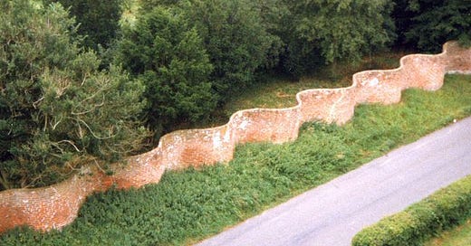
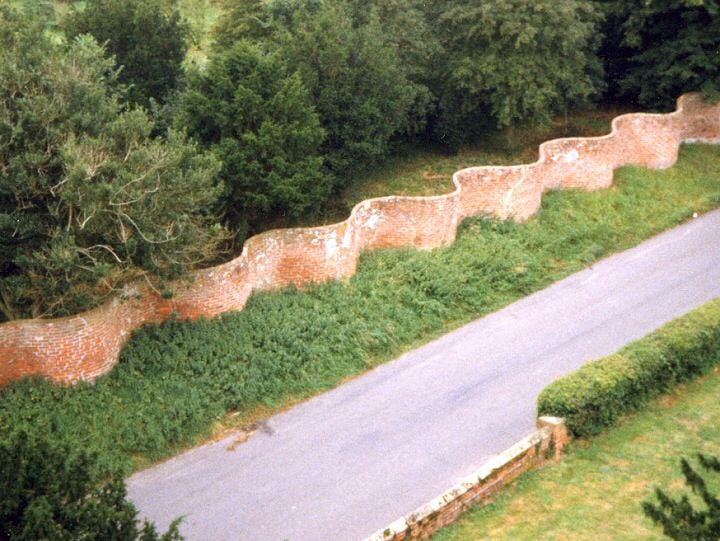
If you are reading this from one of the eastern counties of England you may well be familiar with this seductively curved brick wall or one of its analogues. In the mid 16th century, Dutch engineers that were employed to drain the Fens also began building these unusual boundary walls – known in Dutch as slangenmuur (snake walls).
Their shape however, is no flight of fancy. The undulating layout stiffens the construction meaning that the walls can be built only one brick thick, making them stronger and more efficient than a conventional straight wall made with two courses of brick. It’s the same principle as corrugating cardboard or metal.
Design that achieves greater performance whilst also being more aesthetically appealing is the kind of design I get most excited about. At first glance, focussing on the efficient use of bricks doesn’t sound like the most stimulating avenue of enquiry. The Crinkle crankle wall however shows creativity can still blossom in the most unlikely places.
Design takeaway: How could you revisit the basics of your design in a more inspired way?
🧱 Can’t get enough corrugation? Here is a podcast that tells the story of corrugated cardboard boxes.
Quote: “I like to step into areas where I am afraid. Fear is a sign that I am going in the right direction.”
– April Greiman
April Greiman is a graphic artist credited with bringing to the New Wave aesthetic to from Switzerland to California in the 1970s. Here she offers courage to designers following research or intuition into areas that feel uncomfortable. Keep going! Unease is often a sign you are investigating something interesting.
Keep going everyone,
Ben 🦞
Enjoyed this week’s Design Lobster? Let me know by clicking the heart button.
👇


I'm Dutch and will use this phrase from now on to describe our people, "making them stronger and more efficient than a conventional" - great post!
I do love those undulating walls. Extremely aesthetic! And knowing that they're functional as well is just *chef's kiss*