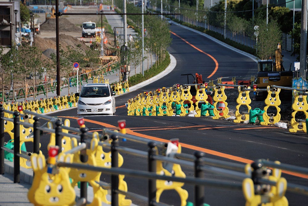
It’s Design Lobster #44 and we’re looking at construction barriers cute enough to cuddle and a poster designed to shock. Flutter those lashes and get your lippie out 💋
✨Enjoying Design Lobster? Please share it with a friend, colleague or fellow designer.
Question: Should your design be cuter?
This year I was introduced to the Japanese kawaii (可愛い) aesthetic in an article by designer Tobias Van Schneider. The word kawaii translates roughly to ‘cute’ and is used to describe things that are charming, vulnerable, childlike or loveable. Most often associated with animé and products for children, this aesthetic is also – curiously enough – used around construction sites to reduce frustration. The large eyes, appealing animal characters and pastel colours are seemingly able to take people’s minds off noise, dust and delay. Reportedly some Japanese police forces also use kawaii to soften their image and improve trust.
Now there is a part of me that finds the deployment of cuteness in these examples to be a little cynical. There’s something about the deliberate misdirection it attempts that is kind of… babying? I rather suspect people’s emotions are not so crudely manipulated. Nevertheless I’m interested in kawaii as an example of how we designers can be more intentional about the emotions we are trying to evoke. Whatever the discipline, a design is always embedded in an emotional journey of some kind.
Design takeaway: How could you be more intentional about the emotions your designs evoke?
🐰 Listen to this podcast on kawaii trends in product design.
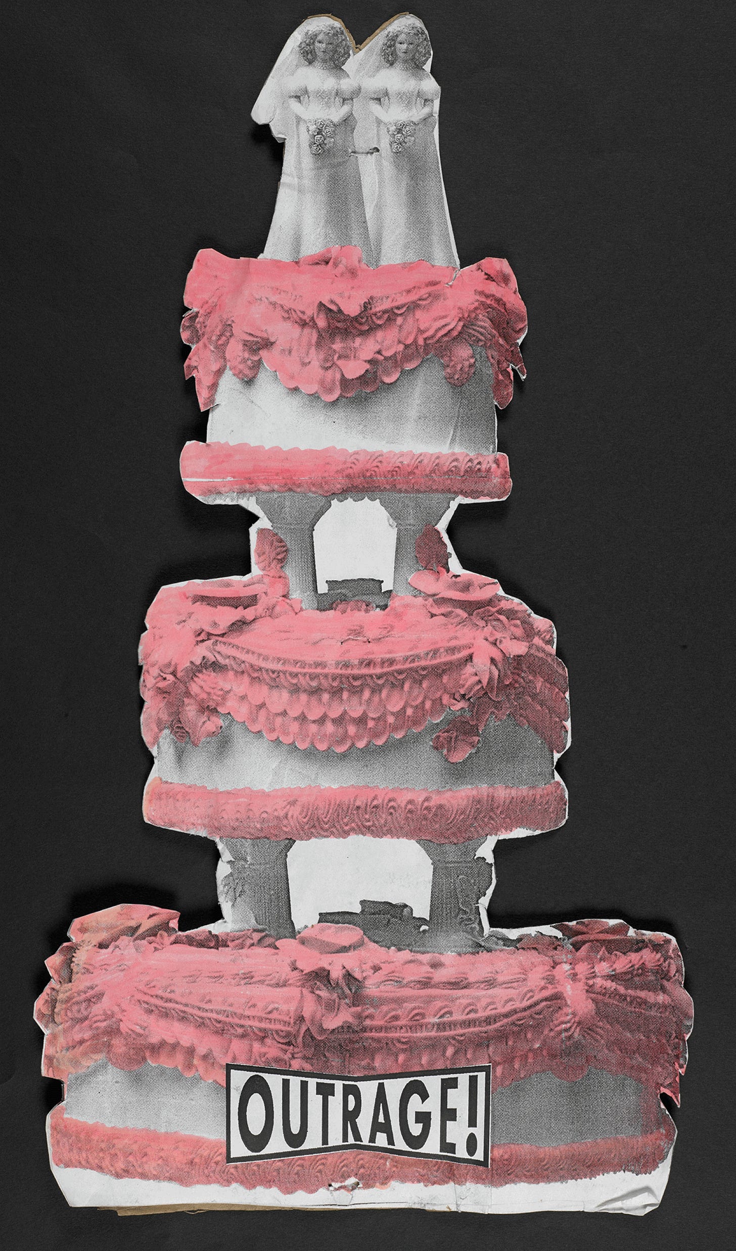
Object: OutRage! poster
October this year marked the 50th anniversary of the first meeting of Gay Liberation Front and to celebrate I’m sharing a poster made by campaigner Peter Tatchell. OutRage! – the group Tatchell founded in 1990 to campaign for equal rights for the LGBT community – used a variety of unconventional (and sometimes controversial) campaigning techniques to draw attention to injustices. One of the more light-hearted actions of the group was to invite the Danish embassy to invade the UK and implement their, then more liberal, legislation.
Street protests were a mainstay of their activities and this poster would have been used at one or several of them. By copy-pasting two brides the posters subvert a classically heteronormative wedding cake into a queer symbol. Tatchell also uses what looks like a highlighter to make the icing a fabulous hot pink. It’s a rough and ready piece of work, but it makes a strong impression. Nowadays, in many countries, wedding cakes like this are instagram fodder, but then it was act of rebellious imagination to put an image like this into the public sphere.
Design takeaway: How could you twist something familiar into a new meaning with your design?
🏳️🌈 Peruse some other great examples of LGBT graphic design from the past 50 years.
Quote: “The first thing you need to make clear to a client is that you aren’t there to answer his wants, but to answer his needs.”
– Lella & Massimo Vignelli
The Vignellis were heroic figures in the New York design scene in the latter part of the 20th century. Famous for works of graphic design including a controversial redesign of the New York City subway map, they also designed furniture, objects and buildings. They believed design was one and designers could apply their process to many different disciplines.
I like the assertiveness of this quote, which is not hard to imagine coming from the famously direct couple. Not taking a client’s requests at face value, but interrogating them to understand the real needs at play, often marks out great design from good. It certainly takes confidence to do this, but your client will thank you in the end.
Keep answering needs,
Ben 🦞
Enjoyed this week’s Design Lobster? Let me know by clicking the heart button.
👇


The job of professional is just as Lella & Massimo Vignelli put it, "answering to clients needs over wants." ...and therein lies the rub! I think we can create a lot of waste designing to visual wants that don't go the distance of designing real solutions.