#22 Letterboxes, survival straws and invisible design
It’s Design Lobster #22. For the first time on a Monday morning! Grab a coffee and settle down to some intriguing design. This week we’re squeezing through letterboxes and drinking from puddles. Yum. 😋
Question: Should everything fit through a letterbox?

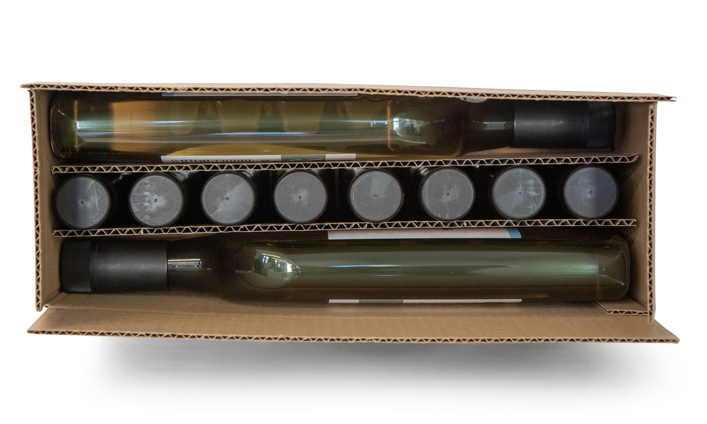
Above: Flat wine bottles from Garcon Wines.
Online shopping has shot up since national lockdowns came into place in earlier this year. Personally I have found myself ordering things online I would never have contemplated before, including beer, plants and even cheese. 🧀
With this new reality has come a new design constraint. The size of a letterbox. Several companies have made great score of offering ‘letterbox deliveries’. Including, here in the UK, Bloom & Wild for cut flowers and Letterbox Hampers for gift sets in shrunken hampers. To grossly misuse a phrase of Marshall McLuhan, the postal medium is the message.
Perhaps the most distinctive of this skinny crowd are the flat wine bottles devised by Garcon Wines for their home delivery service. Originally conceived four years ago, the design has come into its own during the pandemic. Le Corbusier’s assertion that a wine bottle was a so-called type objet and thus unimprovable is proven wrong by the flattened recycled-plastic form of these eminently postable flagons.
For all this cleverness, I still can’t help wondering how relevant the size of a letterbox really is. If we’re now going to be at home all the time, it doesn’t matter if something will fit through the letterbox or not. The postman can drop it on the doorstep and then we can just open the door to bring it in. No?
Design takeaway: Does your design need to travel? If so, will that affect its form?
The full lowdown on Garcon Wine’s bottle.
Object: Survival Straw

Above: a LifeStraw in action.
Ah those preppers. Not content with a few cupboards-worth of pasta and and indestructible clothes, they also sustain another category of survival gear, that of the portable water filter.
One such example is the LifeStraw, which was conceived in the 90’s by Torben Vestergaard Frandsen while observing the public health problems in West Africa caused by the lack of access to clean drinking water. Designed to be a sealed unit with no moving parts and no need for electrical power, it instead uses the sucking action of the human mouth to drive water though 0.2 micron pores that trap 99.999999% of bacteria and 99.999% of parasites. A prodigious technical achievement that thanks to distribution by NGOs has undoubtedly saved many in the developing world from waterborne diseases.
For all this I do find something a bit too rhetorical about the design of the LifeStraw. As shown in the image above, manoeuvring yourself down to the level of the water is uncomfortable and unedifying at the best of times, and in some environments might even put you in danger. I think the designers became perhaps too enamoured with the idea of a magical water straw – losing sight of whether that particular shape was the best one for the job. The LifeStraw Go, a more recent design which accommodates the straw technology in a water bottle shape looks, to me, much more convenient to use.
Design takeaway: Does your design ever require users to adopt a painful or dangerous position?
The Complete Guide to Water Filters for Preppers. 😜
Quote: “Good design is actually a lot harder to notice than poor design, in part because good designs fit our needs so well that the design is invisible, serving us without drawing attention to itself.”
– Don Norman, author of The Design of Everyday Things
I was in two minds about including this quote because I’m not sure that invisibility is necessarily the right thing to aim for in design. I think, especially if the design is helping us to make choices, then the way it is helping us should be made clear and obvious. There are many examples of bad design being quite deliberately invisible – see so-called Dark UX for example.
However, what Don is really saying here is that an encounter with good design involves less stuff feeling awkward, confusing or wrong. And that if enough of those sharp edges can be smoothed away by the designer then a user might forget there are even edges at all. I can get behind that.
Keep discovering. 🦞
Has this email been forwarded? Sign up below to get the weekly emails delivered to you. ✏️


