

#165 Design that takes an interest
A beautiful ceiling lamp + doomprompting 😱
Hello! This week I am sharing some thoughts on what it might mean for design to truly take an interest in our thinking, inspired by some time spent with a new notebook app with some novel ideas about how to integrate AI technology. We’re also admiring a beautiful mid-century lamp by Paavo Tynell and as always I’m sharing a bunch of links with commentary at the bottom.
Some of my readers told me that the essay I shared a couple of weeks ago didn’t reach them due to the big AWS outage that affected Substack. So I’m linking to it below again in case you were affected too. It’s all about design as a dance with norms and expectations.
Something to think about: Software that truly takes an interest
Anu Atluru’s recent piece on ‘doomprompting’, which I’ve also linked to at the bottom of this week’s issue has got me thinking recently about the many disappointments of the current state of AI technology. Every software company now seems to be squeezing a chatbot into their experience and our conversations with them, whilst still technically astonishing, leave much to be desired as an interface between human and machine. In particular I am finding the way these bots attempt to wrest away control of a task or project and do the rest of it for us, especially grating. And slightly troubling too given new evidence about over-reliance on chatbots leading to measurable cognitive decline. The industry as a whole seems to be sprinting towards the idea of autonomous agents that will do unsupervised work for us, but I believe we will need new patterns that sit somewhere below total delegation to deliver on the technology’s true promise.
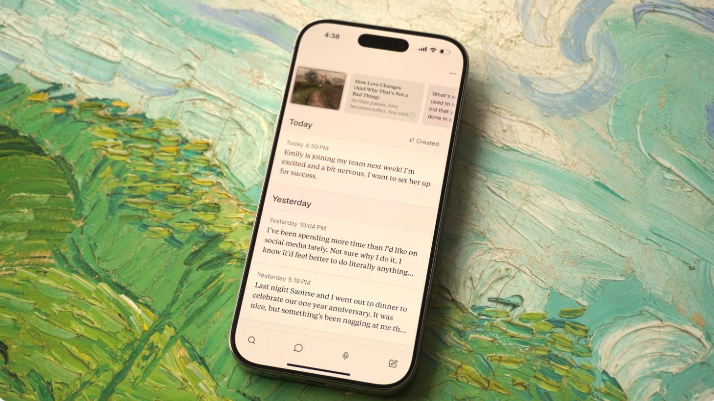
Following these thoughts I’ve recently been trying to find software that sets up a more sophisticated kind of human-machine relationship in the design of its interactions. In my investigations I discovered a remarkable new note-taking app called Lightpage—created by Kasra Kyanzadeh— that has some especially interesting ideas that I wanted to share with you all.
The app bills itself as the first notebook that writes back and the core of the experience is typing or dictating a note each day. The interesting stuff emerges around this, because the notebook uses LLM technology to engage with what you are writing, asking questions that deepen or challenge your thinking, and over time surfacing other pieces of writing or art that have some connection to the themes in your notes. It all contributes to a feeling that the tool is somehow actively taking an interest in the things you care about.
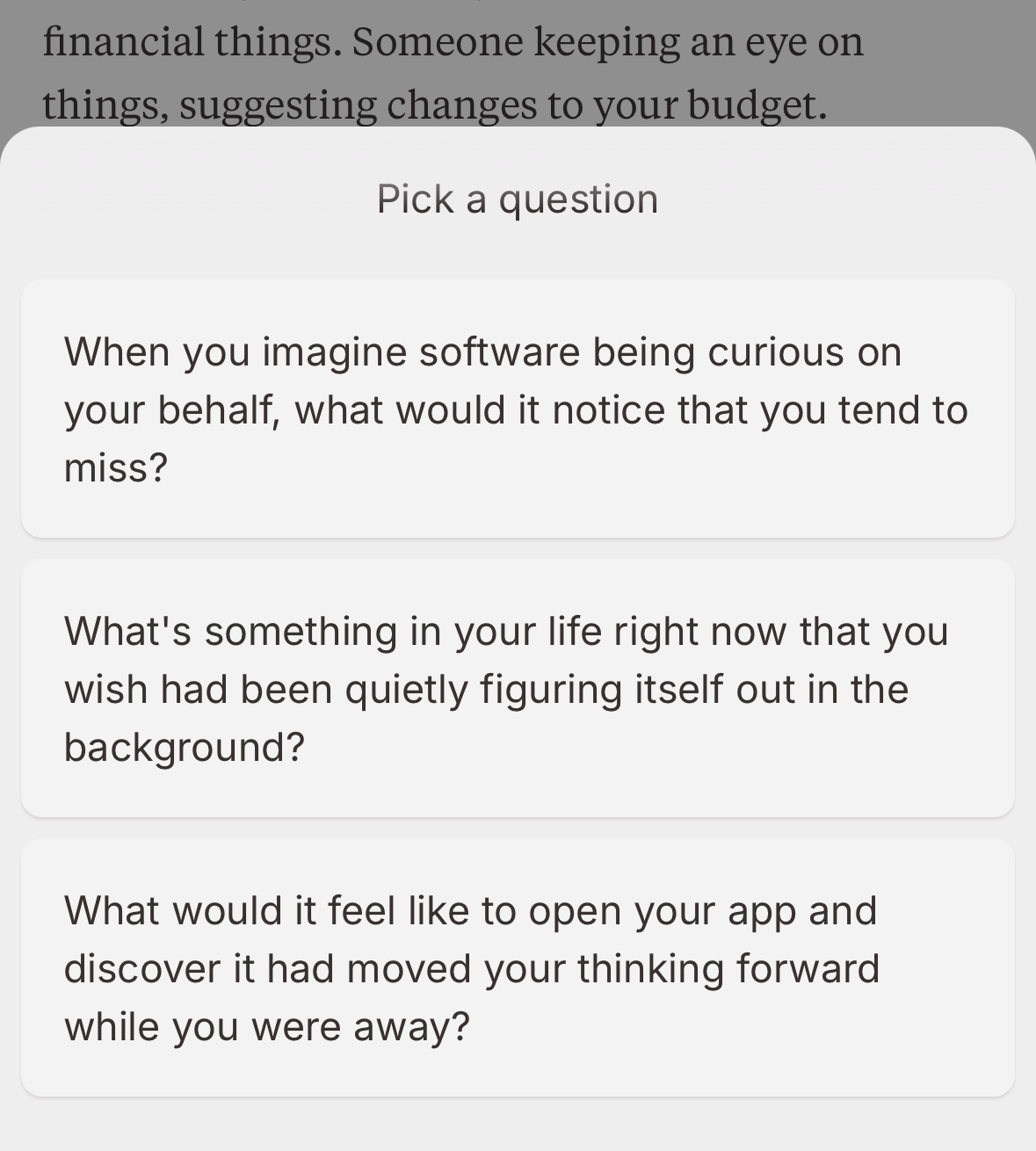
Even just the quality of the questions is strikingly different from a traditional chatbot tool. Whereas ChatGPT’s questions are typically a call-to-action (to keep you prompting) disguised as a question, those in Lightpage are open-ended and feel more astute, the product of actual curiosity rather than an engagement loop.
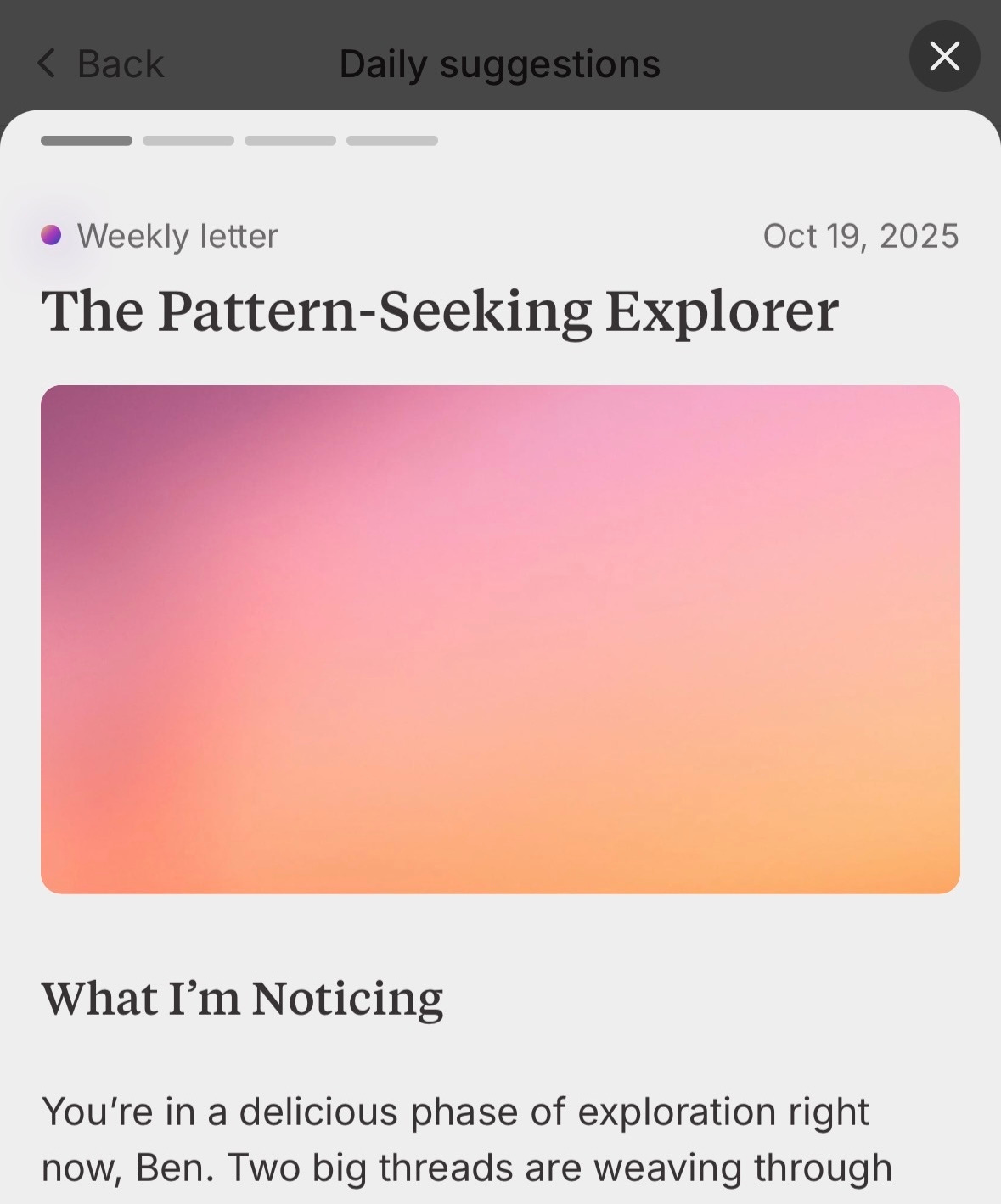
The notebook does also go away and do things in the background in an agent-like way, though in the form of a weekly letter where it reflects on what you have written in the past week and suggests potential connections. As with the other design choices, it keeps your thoughts and ideas at the centre, rather than barging in and giving you its own answer or nagging at you to let it complete the task. I just really like the idea that a tool might ‘notice’ something and bring it to our attention, this feels like a distinctly human-centred design pattern.
All these design choices are undeniably appropriate for a tool that sets out to promote personal development but I suspect they have utility well-beyond this specific use-case. How much of our work might be enhanced by tools that are genuinely engaged with what we’re doing and gently helps us make connections both within our thinking and to the work of others, without pushing us out of the way? I am hoping the next generation of AI products feel much more like Lightpage.
Design takeaway: How well does your design listen to those who use it?
Something nice: Counterbalance ceiling lamp, model A1984
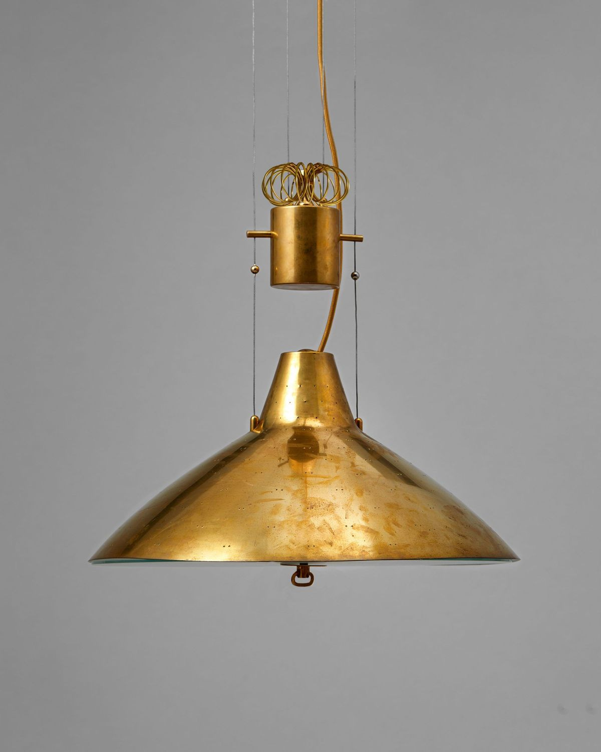
In my last month in New York I house-sat for two artists with a pair of beautiful brass Paavo Tynell bedside lights that I used to read my book each night before going to bed. The golden glow of those evenings reminded me how much of a sucker I am for mid-century Scandinavian lighting and sent me down a bit of a rabbithole recently.
The example I am sharing today by Tynell is known as model A1984, and is a counterbalanced ceiling lamp also in his trademark brass. It was produced by Tynell’s company Taito Oy in the early 1950s for both domestic dining rooms and contract interiors like restaurants that needed height-adjustable light over a table. The counterweight mechanism lets you easily pull the lamp down for intimate, glare-free dining or push it up to wash the room with even illumination from the opal glass diffused electric light.
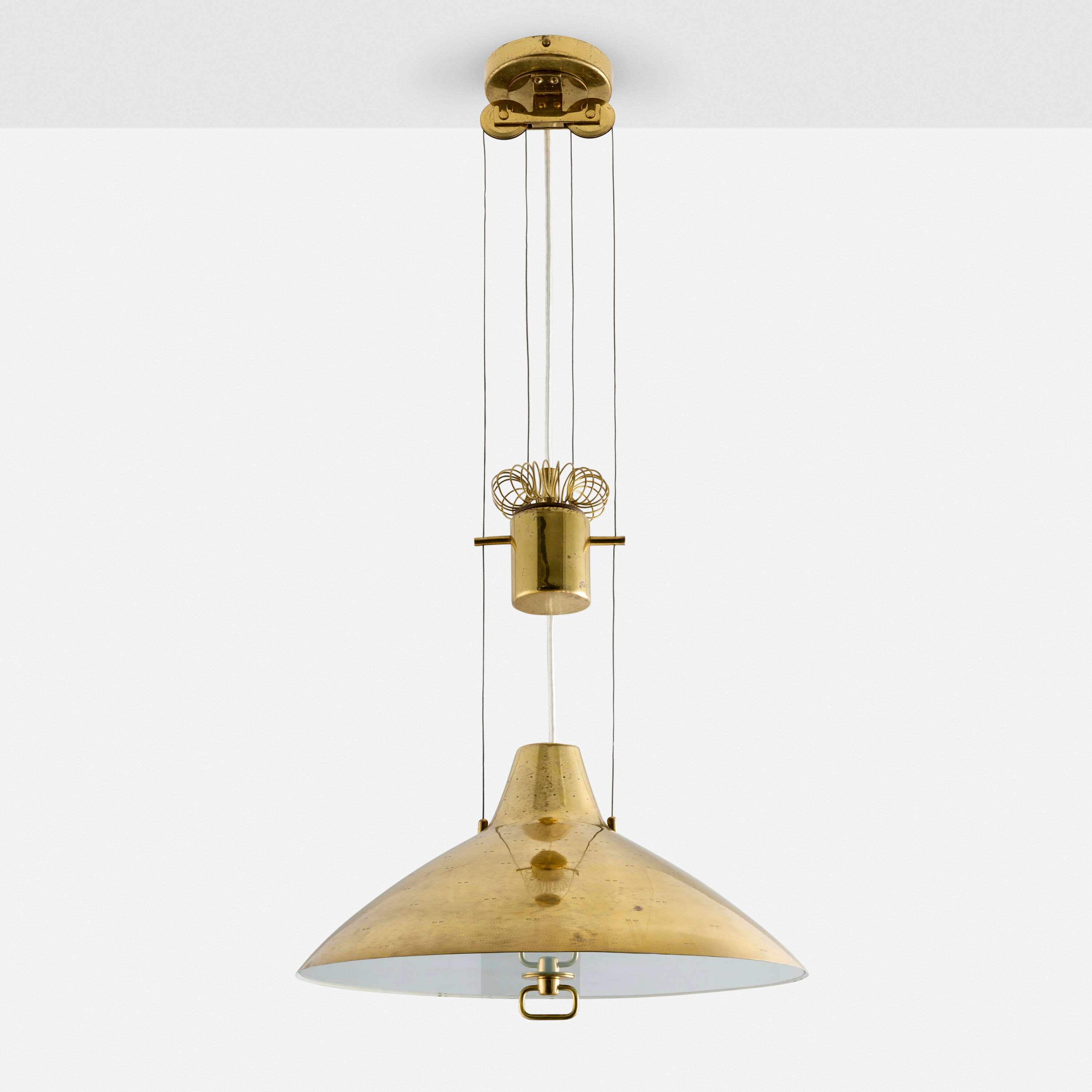
I find lighting design work from this era so interesting because it represents an attempt to humanise the technology of electric lighting. Whereas earlier lights such as those from the Bauhaus tended to express the technology more directly, with cooler temperature bulbs and materials like chrome, here we see conscious decisions to add warmth and detail, and treat lighting as something that generates atmosphere as much as providing useful illumination.
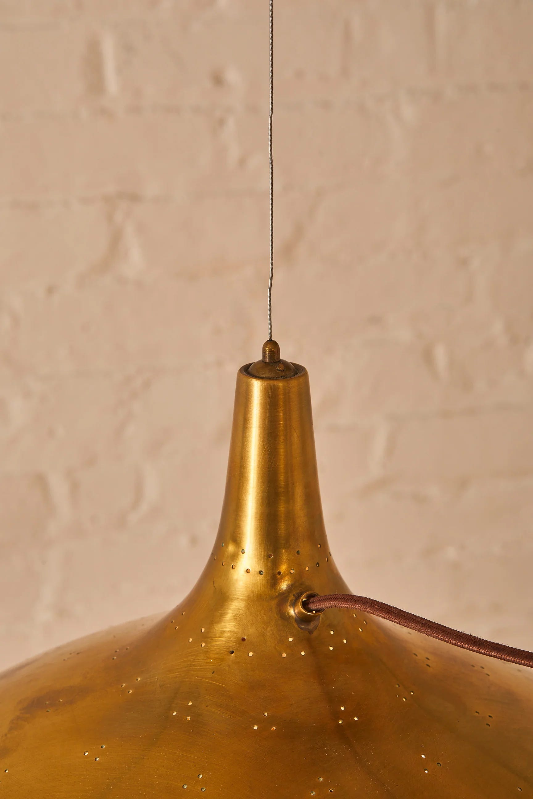
No part of the A1984 ceiling lamp is not functional, and yet the handling of each element shows a sensitivity that is at times almost poetic. I especially love the finely wrought spring detail in the pulley mechanism which a less inspired designer would simply have hidden. Tynell’s characteristic perforations, shown below in a slightly different design, also bear witness to this sensitivity, emphasising the slenderness of the brass and bringing to mind a constellation of stars when the light is illuminated. Though these lamps were mass-produced, these details make them feel highly personal and almost handmade.
The task of design in my mind, is to somehow take a set of requirements and find an articulation of them that exceeds the sum of them. It’s a process of listening for connections and seeing hidden possibilities in a material or a situation. If you’re stuck on something this week, I hope the example of these beautiful lamps might take your work in a new direction.
Design takeaway: What thoughtful touches would humanise your design?
💡More interesting Scandinavian lighting in Design Lobster #43

Enjoying Design Lobster? Share it with a friend, colleague or fellow designer.
What I’ve been reading
Doomprompting by Anu Atluru
Our prompts start thoughtful but grow shorter; the replies grow longer and more seductive. Before long, you’re not thinking deeply, if at all, but rather half-attentively negotiating with a machine that never runs out of suggestions. Have you considered...? Would you like me to…? Shall I go ahead and…?
This piece articulated a gnawing sense of dissatisfaction that I had been feeling about my interactions with chatbots. I dislike the kind of questions they ask at the end of each response, which mostly involve them muscling in and trying to do something for you. ‘Great point’ they say, ‘now shall I take over and do everything from here, yeah?'‘. In this way they mange to be somehow simultaneously obsequious and slightly disrespectful. Not a great combination. Getting beyond this feels like an important UX challenge and will require new design patterns.
A tale of two agent builders by Emmet Connolly
The emergence of AI has obviously pushed software dramatically towards the latter [probababilistic] category, and we’re still collectively figuring out the appropriate UI design patterns here. But both approaches have their pros and cons, and it’s becoming increasingly clear that we will need to figure out how to combine the best of both worlds. I therefore believe that the primary user interfaces of the future will be the ones that most gracefully blend deterministic and probabilistic patterns together.
I thought this piece from Intercom’s VP of Design was an important contribution to one of the big questions in product design in the age of AI. How we bring together classical computation, with its certain outputs and LLM computation which its uncertain ones is a big messy design space right now with lots of experiments. Amelia Wattenberger describes this challenge rather poetically as bridging the hard and soft. There won’t be just one answer to this question, though I am increasingly interested in magic notebook style interfaces such as the one they are trying at Intercom.
What makes Japanese letterforms so irresistible to designers by Tobias Van Schneider
Japanese letterforms basically embody what most designers spend their lives chasing 〰️ A form carrying meaning without depending on literal comprehension (like a good logomark basically). It’s basically visual language at its purest.
Tobias Van Schneider always writes with a strong and authentic voice. In this piece I thought there were some lovely observations about japanese letterforms occupying space whereas western alphabets sit on a line, and the visual closeness the characters still have to brushstrokes, a connection which has been abstracted away in our own script.
Have an interesting week,
Ben 🦞
Enjoyed this week’s Design Lobster? Let me know by clicking the heart button ❤️
👇
Love the counterbalance part of the Tynell lamp. Not sure if I’ve never seen one which is put at the center. For what I remember those which are traditional from my place (mostly made of ceramics) have the weight placed asymmetrical.
Thanks for sharing, interesting reading!