

#161 Design to look sharp
Cat-eye glasses and the Museum watch
Hello! I recently took some time off to see family and friends in the UK so I’m writing to you as a one-off on a Tuesday. I’m back in NYC now and have an exciting roster of newsletters to share over the coming weeks 🦞
There’s certainly been no shortage of design news whilst I’ve been away. Not least the announcement that Jony Ive and Sam Altman are joining forces to create a new family of wearable AI devices. Prompted by this development, for this week’s issue I have pulled together some interesting and unexpected examples of wearable design, from the iconic silhouette of Altina Schinasi’s Harlequin glasses to Nathan George Horwitt’s starkly minimal Museum watch. Enjoy!

Question: What inspired the shape of Harlequin glasses?
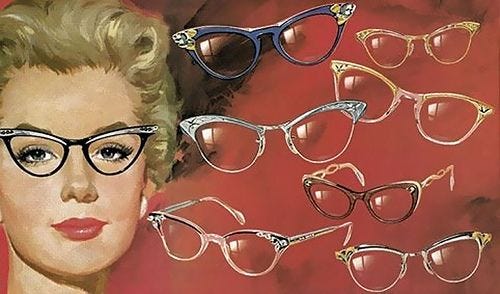
In the late 20s, American designer and artist Altina Schinassi was disappointed by the dull selection of wire-rimmed women’s eyeglasses that were available in the window display of her New York optician. Determined to do something better she cut up a traditional Venetian carnival mask at home to create a pair of glasses with flared corners that accentuated the curve of the brow and gave the wearer greater personality and a hint of mischief. Though it was initially rejected by stockists, a single boutique on Madison Avenue gave her a chance whereupon the glasses became wildly popular, becoming a must have fashion item for women in the succeeding decades. In 1939 the glasses were awarded a Lord & Taylor American Design Award in recognition of their cultural impact.
The design was enabled by the development of pantoscopic lenses that allowed hinges to be placed on the upper part of the frame so the lenses could tilt down the wearer’s face, in alignment with the eye’s natural viewing angle. The growing availability of acetate plastics at the time also propelled their success by enabling a wide variety of vibrant colours and patterns to be offered to suit the wearer’s own sense of style.

As the advert above shows, the design spoke to a burgeoning desire by women to express themselves through their glasses, transforming a workaday medical device into something that people would be proud to wear. It’s a reminder that the objects we wear on our body have a particular need to communicate personality so that they feel less like tools and more like an extension of who we are.
Design takeaway: How could you play with the silhouette of your design?
💍 In Design Lobster #155 we admired The Jealous Husband, an unusual necklace created by sculptor Alexander Calder
Object: Museum watch
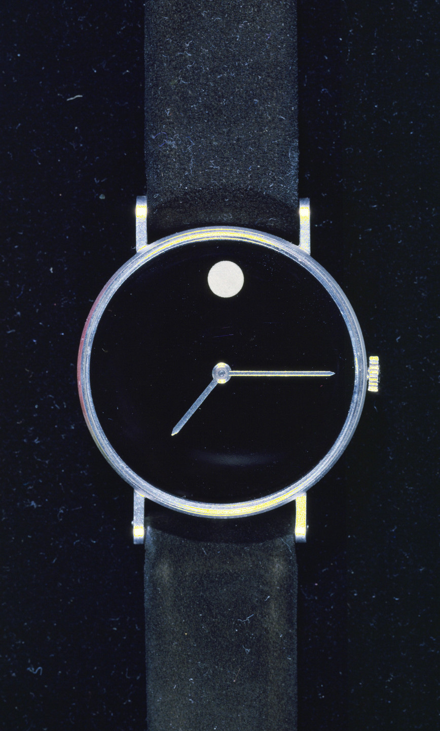
In 1947 industrial designer Nathan George Horwitt conceived of this striking wristwatch design—its stark black dial is entirely devoid of numerals or markers. The watch features instead only a solitary white gold dot at the 12 o'clock position to symbolise both the sun at high noon and the moon at midnight. Whilst clearly in the modernist tradition, the simple addition of the circle gives a faintly pagan touch that nods to the ancient sundial and reflects on the essence of timekeeping.
Despite never really achieving any commercial success for Horwitt (the design was later acquired by Movado who rather brutalised the simplicity of this design in the wristwatches they brought to market) the power of the design was recognised in 1960 by becoming the first watch face to be admitted into the MoMA collection. This accolade earned it the name the Museum watch and for a time they sold a version you could hang on your wall through Herman Miller.
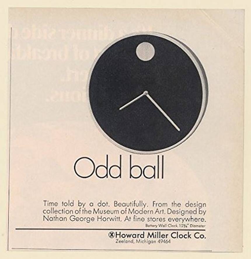
It was interesting to me that OpenAI leaned heavily on the metaphor of a dot for their recent Superbowl ad, which unfolds as a series of ever more complex animations created by a grid of dots. I am eager to see if they bring these any of these ideas to their hardware devices. As Horwitt’s design shows, you can say a lot with a simple design choice like a dot.
Design takeaway: What simple metaphors could you bring to your design to create surprising richness?
🕐 Adorn your home with the wall clock version of Horwitt’s design for a mere $540
Enjoying Design Lobster? Share it with a friend, colleague or fellow designer 🤲🦞
Quote: ““There are people out there so heavily specialised in wearable technology that they call shirts with networked devices built into them ‘wearable shirts.’
They’re so deep into their own silo of futurism that they’ve forgotten how shirts work.”
– Warren Ellis
Warren Ellis is a comic book writer and I wanted to end this week’s issue with this slightly salty quote from him as a warning. The indiscriminate application of technology can easily lead us to lose sight of the human dimension of our work. Whatever grand plans Altman and co are hatching for us I hope they don’t forget to pay attention to the basics.
Have a great week,
Ben 🦞
Elsewhere…
🪦 Designers globally winced at the uncomfortable kerning of Pope Francis’ tombstone. RI P?
🎥 There’s a new film about E1027, the house built in the South of France by Eileen Gray, a designer who I admire greatly.
💙 Jony Ive has been in the news a lot the last few weeks. Here he is in conversation with Patrick Collison of Stripe making the case for soul and care in our work.
💥 Google dials up the expressiveness of the latest version of Material Design. Personality and playfulness, as I’ve been saying for a while, are so back.
Enjoyed this week’s Design Lobster? Let me know by clicking the heart button ❤️
👇
I appreciate the insight to the change in design for eyewear. Who knew what a big industry that would turn into? I had my eye exam yesterday and was frustrated trying to get my face to line up with the chin and head rest for the two of the devices, which have stationary metal bars that are immobile. I mentioned how bad the experience was to the staff and everyone agreed it isn't a great design for so many reasons. I would love to see what you would suggest to improve it.
E.1027 is a wonderful film. I really can not recommend it highly enough.