#155 Design as Art
💭 Thoughts on a grey area
Happy Monday! I’m back from a longer than usual hiatus with an art-filled issue to start your week. We’re exploring the fluid boundary between design and art and admiring some little-known jewelry by 20th century sculptor Alexander Calder. And as always I’ve got a feast of fascinating design links at the bottom of the issue 👀
Question: When does design become art?
In July this year at Figma’s Config design conference I noticed a pervasive desire to bring more humanity, craft and art into the products we design. As I wrote then:
It felt to me like there is some dissatisfaction stirring in the collective subconscious of the design profession at the corner our design systems have painted us into, and a determination to reconnect on a human level with the people on the other side of the screen.
Weather apps and shitty robots - reporting from Config '24
Since then my conviction has only grown that not only designers but the public at large are hungry for more wonder, joy and connection in the products they use everyday and that there has never been a better moment to think more seriously about how to design in the grey area that exists between our discipline and art. But what does that grey area look like? How can we bring more art into a design project? Here are some loose thoughts I have around those questions:
Connect on an emotional or poetic level - conventionally, design is presented as a solution to a problem, but problems always exist in an emotional context, and understanding that and finding ways to pull this into design choices will make a product feel closer to the experience of art. Think of the slow tempo of animations in the Headspace app for example or the tactility of a Work Louder keyboard.
Make space for ambiguity - as technology and design form an ever closer weave around our lives, products that give space for us to reflect on the task and find our own way into it will feel closer to the experience of art. Creative tools like Notion contain this kind of open-endedness and I’d argue some of the magic of AI tools comes from the back and forth dialogue they foster rather than the typical command-response dynamic of other tools.
Reveal something unexpected - art often reveals the world in a new way and design can lean more strongly into this by reinterpreting something familiar. I think that the surreal power of chaos packaging comes from this, even though it can seem kind of silly!
Of course, any discussion in this area needs to carry a health warning. Most design work should not stray into the realm of pure expression and detach itself completely from being simple and practical. The ‘art’ should exist in tension with the functional goals so that they enhance rather than detract from each other.
Design takeaway: How could you bring more art into your design?
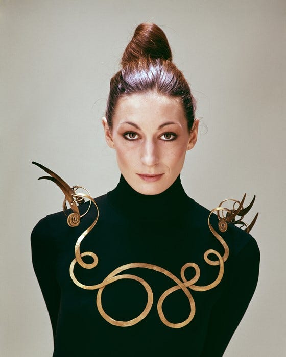
Object: The Jealous Husband necklace

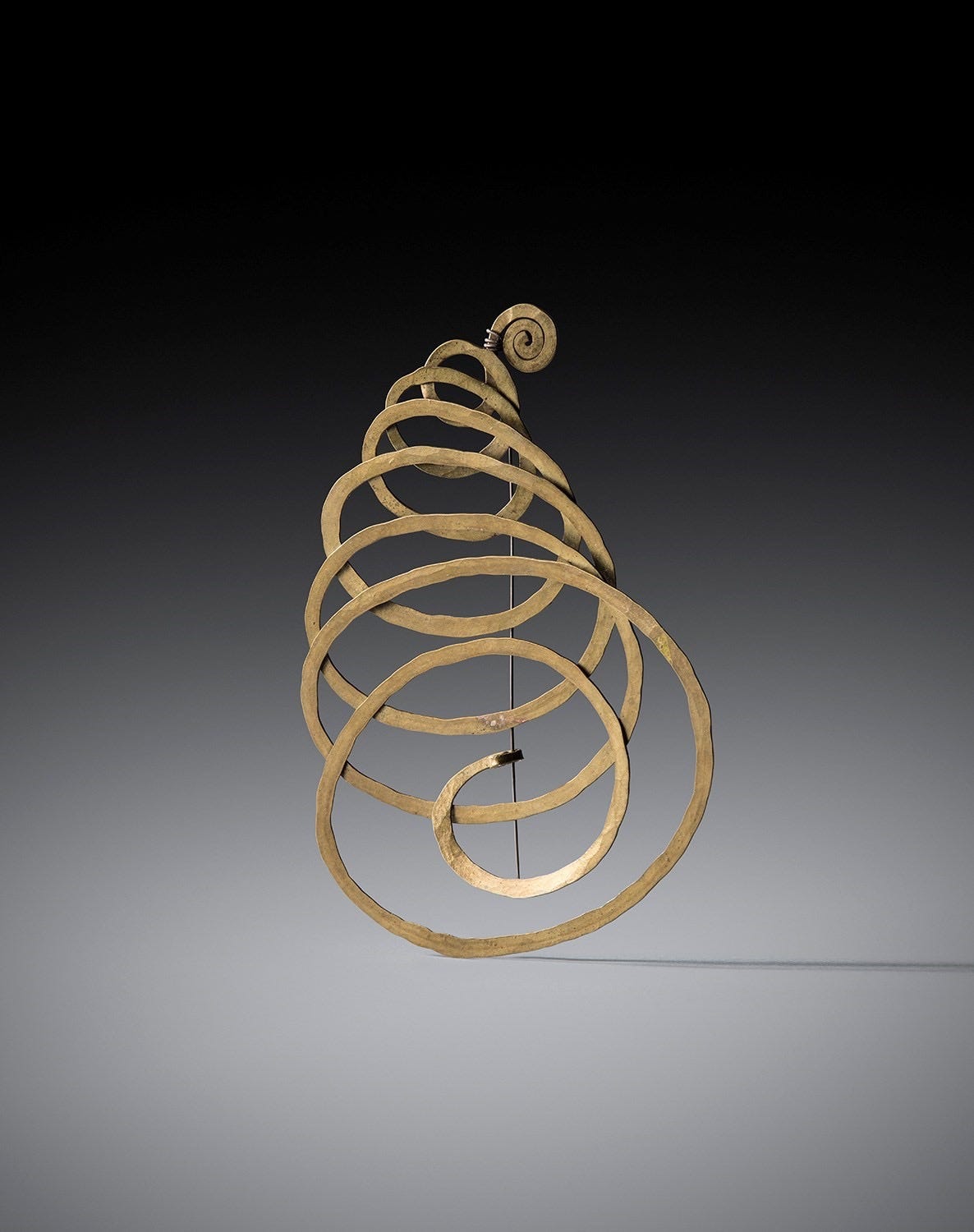
Most of you reading this will have some familiarity with the sculptural mobiles of Alexander Calder, which he produced throughout his life at ever greater and greater scales. Part of his oeuvre is less well-known however. In the period from 1933 to 1952 Calder created about 1,800 pieces of jewellery, that he mostly gave away as gifts for friends and family. They are interesting because they are a relatively rare example of an artist working successfully as a designer and give some clues about how themes from art can be reinterpreted in a design context.
Calder’s jewellery was not made of precious materials but more ordinary metals like brass and copper that are handled quite roughly. Instead their refinement comes from their striking silhouette and velvety patina that gives them the quality of something ancient, perhaps recently discovered by archaeologists. They are not just scaled-down versions of his mobiles, but interpret similar themes of motion, balance and playfulness but in the specific language of jewellery-making.
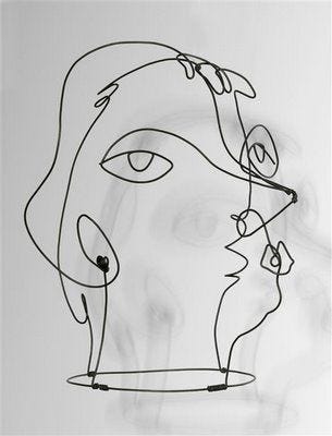
As you can see above, there is a clear connection between the pieces and his wire sculptures, but this does not become overbearing. Even the more intensely sculptural pieces like The Jealous Husband don’t forget that they exist to hang on the body and act as a frame for the face or limbs. Here then is an important lesson: bringing more art into design is a challenge of re-interpretation. Identifying themes and exploring how they can be expressed in a different medium with different rules.
Design takeaway: How would your favourite artist approach the design problem you are working on?
🦞 In Design Lobster #125 we told the story of Salvador Dali’s infamous lobster telephone
Enjoying Design Lobster? Share it with a friend, colleague or fellow designer 🤲🦞
Quote: “I'm in favor of an art that does something other than just sit on its ass in a museum.”
– Claes Oldenburg
I’ve always loved this salty quote by Pop Artist Claes Oldenburg. Why should artistic experiences be something that we hide away in museums? I read it as a challenge for designers to try and find those moments of art in the everyday experiences and objects that we help to create.
Hope you have an artistic week,
Ben 🦞
Elsewhere…
🤖 What does slow AI look like? Why are we assuming that people want more, faster? Has anyone ever said, “if only I could make unlimited presentations”? What if we want to craft one presentation, but do it beautifully?
🛠️ Henry Studley’s tool cabinet - some exquisite design pornography from the 19th century
▶️ How we made MuseScore 4 - my friend and reader Hugo recommended this excellent video by that documents the twists and turns of the design process for this lovingly made piece of software and I just had to share it with you all.
Enjoyed this week’s Design Lobster? Let me know by clicking the heart button ❤️
👇


Thanks so much for the blob shout out! 🙏 I actually did not know that called Calder made jewelry. I’m pretty obsessed with modern jewelry so that came as a surprise. I didn’t know! Thank you so much for sharing.
Lela Vignelli also made some jewelry but I don’t know where it lives now. I don’t think there were nearly as many pieces as Calder…