#158 Decluttering design
"Chartjunk" and a marvelous tool chest
Happy new year! To welcome in 2025 we’re clearing the proverbial decks with some delightful design that shows us how to clarify, organise and declutter. We’re learning what the master of information design Edward Tufte meant by his term chartjunk and ogling a masterful 19th century tool chest that has to be seen to be believed.
I’ve got lots of exciting writing planned for this year on topics as varied as skeuomorphism, game design, luxury and wit. Plus I have a few other mystery updates to Design Lobster that I’ll be sharing soon. As always, thanks for reading 🦞
Question: What is chartjunk?

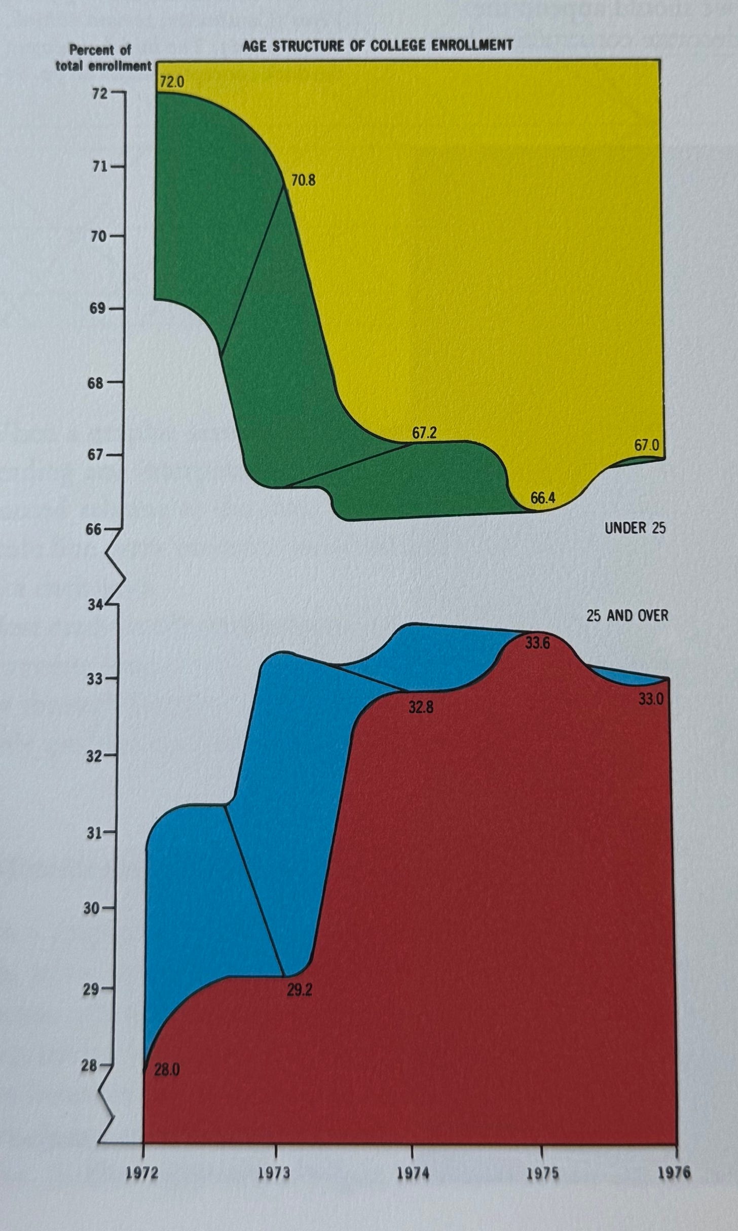
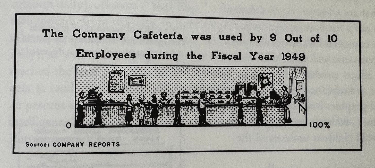
Over the Christmas break I was re-reading my copy of The Visual Display of Information by the legendary statisitician and information designer Edward Tufte. One of the delightful neologisms he coins in the book is chartjunk, a term he uses to describe elements of a data visualisation that detract from the story that the data is telling, or otherwise impede easy comprehension. Tufte specifically calls out overheavy gridlines, moiré patterns from overenthusiastic use of hatching and decorative embellishments like 3D effects and imagery as among the worst types of chartjunk. Brace yourself and take a look at the 1970s example below for an example of the latter, a type of chart that Edward Tufte calls a duck.

Often these kind of visual embellishments are well-intentioned, aiming to provoke a reader’s interest or otherwise bring numbers to life. Tufte cautions against such intentions getting the better of us and ending up obscuring the real meaning of the data that it being presented. I am nevertheless obsessed with how wild this bar chart example below from his book is!!
Tufte’s underlying idea of a data-to-ink ratio – ie how much ink have we used to visualise a given amount data – is a powerful one (even if now we’d probably call a data-to-pixel ratio) and it’s one you can translate to nearly any design context. How much ink/material or pixels does your design expend to deliver the outcome that the person using it cares about? And do you really need to use quite as much?
Design takeaway: What “junk” could you clear out from your design?
📈 In Design Lobster #71 we looked at an emotionally powerful infographic by Charles Joseph Minard
Object: The Studley Tool Chest
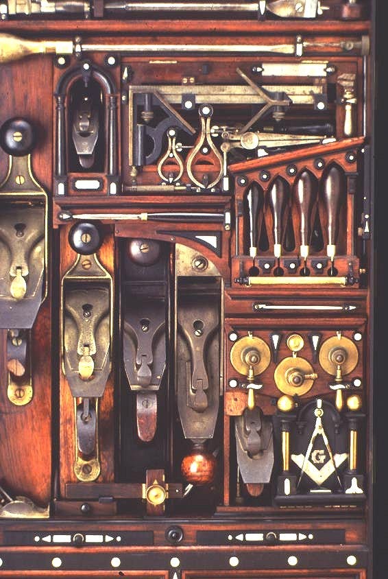
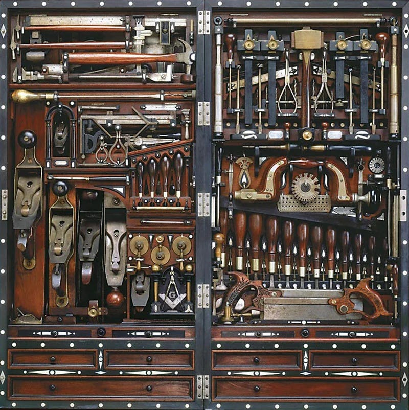
Henry Studley’s tool chest is a compact marvel of 19th-century craftsmanship. Measuring just 39 inches tall, 18 inches wide, and 9 inches deep, it somehow houses over 300 tools—each meticulously arranged to maximise space whilst remaining easily accessible. The density of tools is so extreme that despite its size the chest reportedly requires three people to actually lift it.
Henry Studley was a piano-maker who worked at the Poole Piano Company in Massachusetts for 30 years. He built the chest himself over the course of his career, continually revising it to add new tools. Each one slots neatly into a custom holder, many of which hinge upwards to reveal an additional layer of tools beneath. Tolerances are breathtakingly tight and there is meticulous care shown throughout: repurposed scraps of ebony, rosewood, and ivory are inlaid as decoration and some tools like the Stanley plane are recessed into a charming arched niche.

We designers love to talk about craft and I love the way this historic chest sets an incredible benchmark of care for us to aspire to in our own work in 2025. If you’re in the Northeastern US and want a dose of inspiration in-person then you can find the chest on display at the Smithsonian Museum in Washington D.C.
Design takeaway: How could you bring together the parts of your design with more clarity, precision and care?
▶️ Watch a retro video showing all the drawers and hidden compartments of the chest
Enjoying Design Lobster? Share it with a friend, colleague or fellow designer 🤲🦞
Quote: “It is better to violate any principle than to place graceless or inelegant marks on paper.”
– Edward Tufte
Another quote from Edward Tufte to round off this week and remind us to take any design “rule” with a pinch of salt as we head into a new year. A great designer never allows a pretty theory to distract them from what is in front of their eyes.
May you have a graceful and elegant start to 2025!
Ben 🦞
Elsewhere…
🔮 It’s the time of year for 2025 trend predictions and this crowdsourced set from Emily Sundberg was the most interesting one I’ve found so far. Design (furniture, lighting, collectibles) will continue to grow its market share and position in contemporary culture as the creative class in cultural capitals seek new avenues of exclusivity.
👁️ These linen tablecloths from Casa RIXO are a visual treat.
☕️ In the early 200s, artist Pierre Sernet performed a Japanese tea ceremony with strangers in over thirty countries. The installation saw Sernet set up a “Tea Room,” denoted by a wood cube, in different global settings. He then sat and waited for a volunteer to participate in the ceremony and drink the cup of matcha that he prepared in front of them.
📱 I love the term ‘promptotyping’ that I read in David Hoang’s newsletter this week. The phrase is a play on the classic skill of prototyping, but using LLMs and Gen AI to craft them.
Enjoyed this week’s Design Lobster? Let me know by clicking the heart button ❤️
👇


wonderful piece. thank you for sharing! my mother took me to see an Edward Tufte lecture when i was a kid. At the time, i wasn’t able to fully appreciate it but now i’m obsessed with him. i think about his principles in my own architectural design work actually hahaha.