#71 Data you can feel
Powerful infographics and an air sensor that sings
It’s Design Lobster #71 and we’re exploring designs that plumb the emotional side of data. From an 19th century infographic with a powerful message about war, to a friendly avian air sensor. Putting the heart in charts❤️📈
✨Enjoying Design Lobster? Please share it with a friend, colleague or fellow designer.
Question: How emotionally powerful can a graph be?

I’ve been re-reading Edward Tufte lately and was reminded of this remarkable infographic by the 19th century French Civil Engineer Charles Joseph Minard. It represents the size of Napoleon’s army over his ill-fated Russia Campaign from 1812-13. The bar of the infographic is sized to represent 1000 men to each millimetre and is mapped onto the geography of the army’s route across Europe, with a chart underneath that also shows the (freezing) average temperature at each stage.
It tells a powerful story of terrible loss. Anyone could tell you that 422,000 men set out but only 10,000 returned, but seeing the way the flow diagram dwindles to the size of a pen stroke communicates this story far more viscerally.
“The aim is … to make relationships quickly apparent to the eye, relationships that are instantly grasped where numbers would require the mediation of a mental calculation..”
— Charles Joseph Minard
Minard was very good at knowing what to prioritise in his infographics. Whilst his flow areas were accurate to the millimetre, he takes much greater liberties with geographic accuracy. The story here is the awful loss of life, and the design choices serve to tell that story in the most concise and visually arresting way.
Design takeaway: Is your design telling the right story?
🐘 Not many people know Minard also did a sister diagram showing Hannibal’s military campaign in 219BC…
Object: AirBird
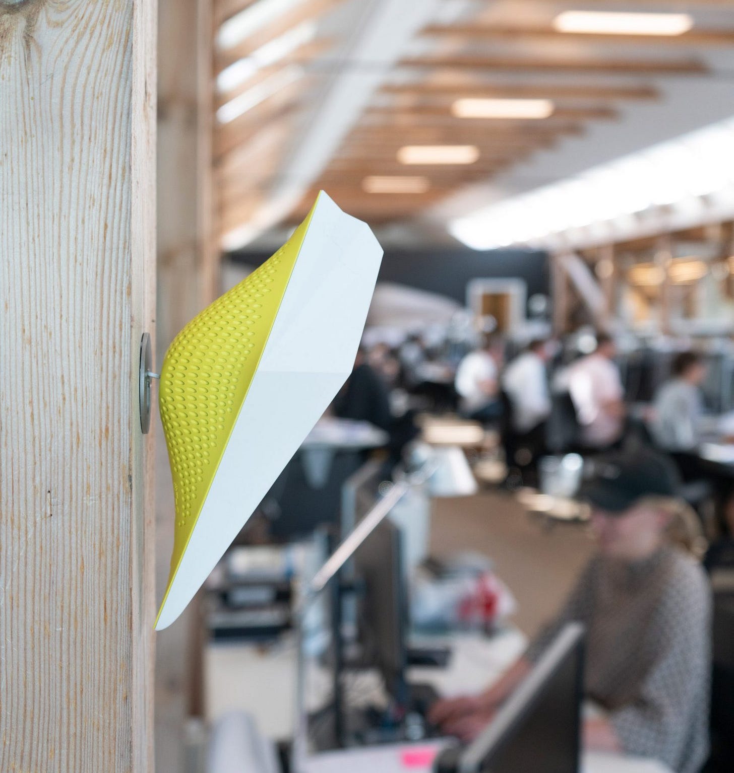
Data doesn’t always need to be visualised to be understood or felt. I recently learned about the AirBird designed by GXN which incorporates a suite of sensors into a bird-shaped enclosure. Intended for offices, it measures the carbon dioxide level in a room and cheeps noisily when it passes a certain threshold. By alerting people to this otherwise intangible reality it allows them to move somewhere else or open a window to prevent any adverse health effects.
The design of course is a nod to the 19th century practice of keeping canaries in mines. Those poor birds unfortunate susceptibility to gas leaks would alert miners to dangerous air quality and give them warning to surface before it was too late.
I’m always interested in how computing can be embedded in objects beyond the smartphone. I like to think that in the future information will be delivered to us not just by a barrage of notifications but more ambiently — perhaps by furniture that glows or changes colour or singing objects like this digital bird.
Design takeaway: Could you deliver information through your design without actually showing anything?
🎩 Watch a TEDx talk about “enchanted objects” by David Rose.
Quote: “When I am working on a problem, I never think about beauty. I only think about how to solve the problem. But when I have finished, if the solution is not beautiful, I know it is wrong.”
– Richard Buckminster Fuller, designer and futurist
Richard Buckminster Fuller was famous for inventing, among many other things, the geodesic dome and Dymaxion house. I really like his idea to use the beauty or elegance of a solution as a test to check if a rational thought process has lead you to the right place.
Hope you can make something beautiful this week,
Ben 🦞
Enjoyed this week’s Design Lobster? Let me know by clicking the heart button.
👇


love the buckminster fuller quote!!
Love that Fuller quotation!