#142 Design Quality
Writing paper, growth and things we cannot name
This week’s Design Lobster is obsessing over quality. We’re diving into design theory via a very special house in Cambridge and drooling over some well-made stationery. If you love nice things, I think you’ll love this one ✨
Question: What is “the quality without a name”?
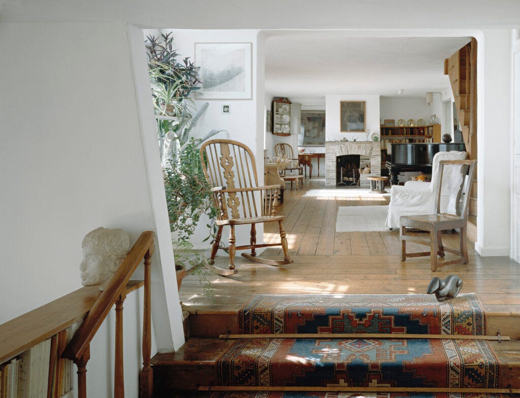
One of my favourite places in the entire world is Kettle’s Yard, the former home of Jim and Helen Eade in Cambridge, UK. They created it in the mid 50s by combining four cottages in the north of the city and filled it with paintings, sculpture and objects that they collected as part of Jim’s work as a curator for the Tate Gallery.
I visited for the first time as a first-year architecture student at the university and was immediately captivated by the wonderful atmosphere of the house. Jim and Helen created rich relationships between the artwork and the spaces, most famously placing a fresh lemon on a pewter bowl every few days to highlight the flash of yellow in a nearby Miró painting.
It was whilst I was a student at Cambridge that I was introduced to the work of Christopher Alexander, whose ideas and buildings have appeared a few times in past issues. In Alexander’s influential book The Timeless Way of Building he presents architecture and design as the pursuit of a ‘quality without a name’, which he rather cryptically describes as a combination of wholeness, humaneness and timelessness that is impossible to put into words but which all of us know when we encounter it.
When I think of what he means by this quality I go back to the rooms of Kettle’s Yard. The way they seemed so alive and comfortable in themselves, the curious feeling when you are in them that time has somehow slowed down. Language falls short of capturing this quality, it simply has to be experienced. One of the reasons why prototyping and other ways of working directly with materials are so important in the design process is because much of a design’s impact is nearly impossible to experience via language alone.
Design takeaway: Does your design feel alive, whole and comfortable? Or is something missing?
💻 In Design Lobster #122 we explored Alexander’s influence in the software industry
Enjoying Design Lobster? Share it with a friend, colleague or fellow designer 🤲🦞
Object: Smythson Writing Paper
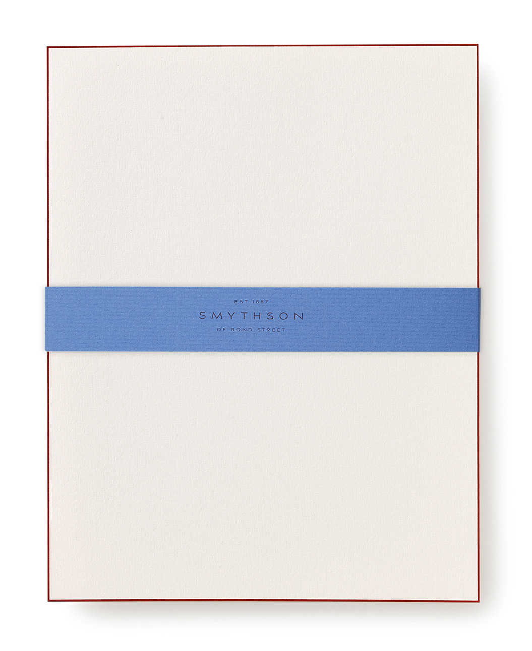
I am a terrible sucker for tasteful stationery and have spent more than I care to admit on products like pens and paper that my economist father would rightly describe as commodified. I was indulged in my office supplies habit a few years ago by a relative who bought me a gift of Smythson writing paper, which arrived in its trademark pale blue box, bound in a slim ribbon of the same colour. For as long as it lasted, I took great pleasure in the way the 140gsm creamily textured paper made my scratchy thank you letters and notes feel weighty and rather magnificent.
Frank Smythson began selling stationery from premises on Bond Street in London in 1887, gaining acclaim in the early 20th century for their ultra-thin ‘featherweight paper’ that allowed their pocket datebooks to be exceptionally slim whilst still holding fountain pen ink without leaks. Today, they stock twelve different types of paper, all made from 100% English wood pulp and delicately watermarked with the company logo. It never ceases to give me pleasure how a designer can take something ordinary like paper and elevate it until it becomes almost a work of art.
Design takeaway: How could you elevate the ordinary elements of your design?
👗 In Design Lobster #58 we looked at a surprising 60’s disposable paper dress
Quote: “…I know there's this saying of it's growth versus quality, but quality is growth. And if you think about how you can make your product easier to use and more understandable, that will of course drive people to use it, and use more of it, and have a better experience with it that they'll want to talk about with others.”
– Katie Dill, Head of Design at Stripe
Katie Dill was on Lenny Rachitsky’s podcast recently, giving her perspective on design quality. You can have a listen here. Perhaps because encountering quality still feels so rare and surprising we feel compelled to talk about it to others – which is of course great news if you have a business you want to grow.
I’ve found it can be surprisingly easy for companies to talk themselves out of delivering something high-quality with the aid of a spreadsheet. The irony might be that this decision ends up harming the business in the long run.
Have a great week,
Ben 🦞
And lastly, a design remix…

Enjoyed this week’s Design Lobster? Let me know by clicking the heart button ❤️
👇


