In this week’s Design Lobster we’re grappling with bad design of all kinds. We’re asking whether there is truly ‘no such thing as a bad idea’ and (reluctantly) trying on a nightmarishly bad 80’s beauty product 😱
Question: Is there no such thing as a bad idea?

Designers love to say that there is ‘no such thing as a bad idea’ and indeed the phrase has, in certain settings, now become almost a cliché. When uttered at the beginning of workshops the phrase is intended to quell our inner (and outer) censors and create a space where the group can come up with ideas in an uninhibited way. The theory here is that if we’re prepared to embrace (or at least tolerate) bad ideas early on we’ll explore more widely, challenge or uncover hidden assumptions and ultimately reach a better solution in the end.
This week I had a conversation with a junior designer who I’m mentoring which highlighted just how unintuitive this concept can feel when it’s new to you. As we chatted I realised how deeply they identified with making something that was beautiful and worked well and how hard it felt to let go of that, even temporarily.
The metaphor I shared with them was of a topographic map that contained all the possible solutions to a particular design problem. To find the highest peaks— ie the very best solutions—and not just a middling-sized hill you have to explore as wide an area as possible, which means sometimes finding yourself in deep canyons on the way!

Indeed as the r/badUIbattles subreddit shows there is a deep well of creativity to be drawn from if we let go a little and actually set out to create something deliberately bad. Besides being very funny, these examples of totally unusable forms and buttons genuinely open up the space of what is possible in interface design. I can almost feel my brain starting to fizz with ideas as I scroll through them.
Design takeaway: Are you taking bad design seriously enough?
🤨 From the bad to the ugly, Design Lobster #105 explored the perverse appeal of ugly design
Enjoying Design Lobster? Share it with a friend, colleague or fellow designer 🤲🦞
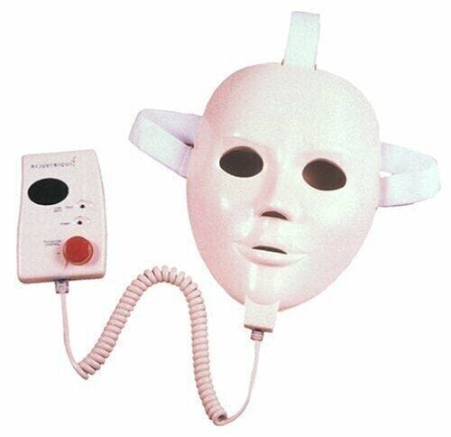
Object: Rejuvenique Facial Toning Mask
And now for something truly awful. I found this product in the Museum of Failure’s Hall of Shame and was instantly intrigued. Released in 1999 the mask claimed to “exercise” your face by pulsing electric shocks through 24 gold-plated “cushions” on its inner surface. Despite never being approved by the FDA it nevertheless found celebrity endorsement in the form of Linda Evans of Dynasty fame, who can be seen hawking it in infomercials from that year.
To state the obvious, the design of the Rejuvenique could not be creepier if it tried. I am especially baffled by the decision to crudely anthropomorphise the mask with eyebrows and full lips which only makes the uncanniness worse. And every step of the experience for the user sounds unpleasant, from applying drippy blobs of gel to each cushion before putting it on, wincing with pain as the current starts and then removing it to find your face mottled with sore red marks.
And all of that is to leave aside the fact that shocking your face with does not actually provide any health benefits whatsoever 🤷
In spite of the failure of the Rejuvenique, I was surprised to learn that the facial mask category lives on in the form of LED light masks, which while somewhat more scientifically respectable, have seemingly learned no lessons about how to look less frightening. VR headset makers take note: designing products that are worn on the face is a minefield of potential pitfalls. Style here matters!
Design takeaway: Does your design make your user look or feel better?
🙀 Watch the original 1999 infomercial and weep
Quote: “Bad design is smoke, whilst good design is a mirror.”
– Juan Carlos Fernandez
I love the poetry of this quote. Whereas bad design leaves us confused and disorientated, good design is clear, elegant and reflects back something of our own nature.
Have a good (or should I say bad? 😉) week,
Ben 🦞
And lastly, a design remix…
Enjoyed this week’s Design Lobster? Let me know by clicking the heart button ❤️
👇


