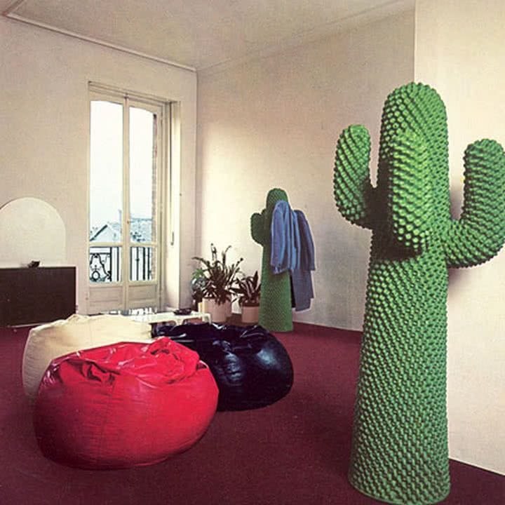
It’s Design Lobster #51 and we’re venturing off-planet to explore why some scientists are looking at using timber to make satellites. Plus a radical 70s coat-stand. 🚀
Also… a special welcome to my new readers who found me via Platformer. I’m so happy to have you here. 😊
✨Enjoying Design Lobster? Please share it with a friend, colleague or fellow designer.
Question: Why build a satellite out of wood?
You wouldn’t necessarily think it staring up in into the night sky, but there are 6,000 satellites orbiting Earth – 60% of them no longer operational and classified as space junk. By 2030 the total number of space objects is expected to more than double to 15,000. All this junk is not just an aesthetic problem – in orbit debris can travel at up to 23,000mph causing dangerous collisions. Anyone who has watched the film Gravity will have a vivid sense of the risk to other satellites and human life posed by this extra-terrestrial mess.
Various different proposals to clean up space have been proposed. From craft that throw giant nets to ones that use magnets to shift orbits. Most of these proposals involve shepherding the junk into a lower orbit so it can burn up on re-entry in the Earth’s atmosphere. But re-renty is no panacea. Not only is there a risk of large debris hitting the ground but the very process of satellite materials burning up in the atmosphere releases harmful ozone depleting gases such as Aluminium oxide.
A group of scientists at Kyoto University are working with manufacturer Sumitomo Forestry on a potential solution to this re-entry problem by exploring timber as a casing material for satellites. Reducing the mass of metal in a satellite means fewer harmful gases and a lower risk of large debris hitting the ground. Because wood is transparent to radio, it also means nearly all the working parts can be kept inside the casing, further protecting components from potential collisions whilst in use.
Given how fiendishly difficult it is to get things into space, it’s perhaps no wonder scientists have had a bit of a blind-spot for the later parts of a satellite’s lifecycle. I think this story is a great example of how putting a problem in a wider frame can lead to unexpected solutions. Whether or not you use materials in your design work, I think there’s something to learn from that.
Design takeaway: What unexpected design choices might you make if you took a longer view?
🛰 99% invisible have a great podcast from 2016 about collecting space ‘treasure’.
Object: Gufram Cactus Coat Stand
Should your coat stand be… squishier? This so-called “hall-tree” was designed in the 70s by Italian designers Guido Drocco and Franco Mello and manufactured by Gufram in Northern Italy. Made from a polyurethane foam that is painted in Guflac – a patented mouldable varnish – the cactus is 1.7m tall but weighs only 22kg.
This object is one of the most iconic examples of the Italian Radical Design movement that emerged between 1965-75 in Florence. This was a time of social upheaval in Italy and the works of design in this movement channel that restless energy – challenging assumptions for why objects should look or behave a certain way. Most coat-stands are quiet pieces of design made of wood or metal that use a few hooks to keep clothing away from the floor. Drocco and Mello flip all that convention on its head by making a coat stand that is an attention-seeking piece of desert sculpture, made of cutting-edge plastics and squidgy (not prickly) to the touch. I have some questions about its ability to hold a heavy winter coat but hey, it’s surreal and a lot of fun.
Design takeaway: How could you add a bit of fun back to your design?
🌵Watch a film about Italy’s Radical Design movement.
Quote: “The fundamental failure of most graphic, product, architectural and even urban design is its insistence on serving the God of Looking-Good rather than the God of Being-Good.”
– Richard Saul Wurman
Wurman was an architect and designer who went on to found TED Conference. We last heard from him in Design Lobster #39. Here he describes the trap awaiting designers who limit themselves just to getting the aesthetics right. Don’t succumb to a false God - Being-Good is about much more than looks! It’s so important to stay curious about how every aspect of your design works.
Whatever you do, stay curious.
Ben 🦞
Enjoyed this week’s Design Lobster? Let me know by clicking the heart button.
👇


You should consider doing a post on Dark Mode, which is a design pattern that has become quite common across apps and devices!