Design Lobster #95 is here to intoxicate you with some tales about design. From a room in China that simulates how it feels to be drunk, to the stories behind different types of wine bottle. Cheers! 🍻
✨Enjoying Design Lobster? Please share it with a friend, colleague or fellow designer.
Question: Can a room make you feel drunk?
The port city of Qingdao (青岛市) on the eastern coast of China has a distinctly Bavarian architectural aesthetic due to German colonial presence there in the 19th and 20th century. Another legacy of this history is the Tsingtao Beer Factory, founded in 1903 by a German-English joint venture and nowadays the origin of China’s largest export beer, the namesake Tsingtao Beer.
Among the attractions at the Beer Factory is a curious room that causes visitors to stagger and lose their balance whether or not they have enjoyed a pint or two of the factory brew. It achieves this effect by featuring a pronounced tilt and a trompe l’oeil window that further disorientates the brain. It’s a simple (and rather silly) trick but also a fun example of the way design can interfere with even our most fundamental senses.
Design takeaway: Are you being intentional with the senses your design engages?
▶️ Here’s a video of the effect the room had on one visitor
Object: Wine bottle
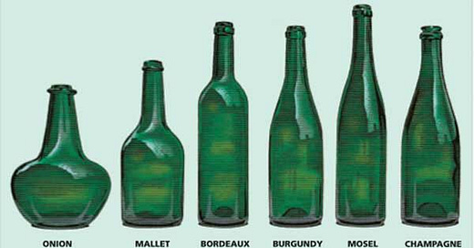
The French architect Le Corbusier described the wine bottle as a so-called objet-type, by which he meant its form had been perfected through industrial mass-production into a kind of Platonic ideal. It was an important idea in his early architecture, but seems curiously blind to the diversity of wine bottle shapes that exist in reality – just a few of which are shown above. Each of these shapes gives the bottle a distinctive personality, but there is a pleasing rationality to the form-making of each one too.
The Burgundy bottle above – associated with Chardonnay and Pinot Noir – became popular in the 19th century. Its smoothly sloping shoulders was easier for glass-makers to blow. The high shoulders of the Bordeaux bottle were a later innovation reportedly intended to help collect sediment during the decanting process of the Cabernet Sauvignon and Merlot wines it would hold. The more slender shape of the Mosel bottle apparently originates from the route that Riseling wines took to market, in the hulls of Rhine river boats, where their narrowness helped pack more in.
Of course over time, the shape of each bottle has taken on cultural meaning, becoming part of the brand for a particular wine. But perhaps the most important design feature of all these bottles was the ability for them to be binned or stored on their side, so that the wine touched the cork and ensured a wet seal from oxygen that would otherwise ruin the wine’s flavour.
Design takeaway: What practical problem(s) does the form of your design solve?
🍾 Watch a video that digs in deeper to the shapes of wine bottles
Quote: “Live the full life of the mind, exhilarated by new ideas, intoxicated by the Romance of the unusual.”
– Ernest Hemingway
Who else could I quote from this week but Hemingway – of course no stranger to the seductions of a bottle of wine or bourbon. I think this quote from his collected Stories has a somewhat ironic dimension in its original setting, but I’m offering it here genuinely.
May your week be full of new and unusual ideas!
Ben 🦞
PS Did you know hamsters love a drink a two? Well now you do!
Enjoyed this week’s Design Lobster? Let me know by clicking the heart button.
👇


