#67 Form is everything
Calming buildings and chairs that hug you
In this week’s issue we’re exploring the idea of form in design. From buildings that help cool down arguments, to chairs with arms that hug you. 🤗
✨Enjoying Design Lobster? Please share it with a friend, colleague or fellow designer.
Question: Can a lower ceiling calm people down?
Togunas are a type of indigenous courthouse building associated with the Dogon people of Mali. They are usually built from wood and thatch and located in the centre of villages, providing shade from the midday sun. I learned about them in the book How Design Makes the World by reader Scott Berkun.
What’s fascinating about them is the way they are deliberately designed with a very low ceiling. This means that no one can fully stand up in them, preventing discussions from getting too heated or even violent. Disputes must instead be resolved with everyone seated, inherently a more relaxed and conciliatory posture. I find the idea you can nudge people into a more appropriate mental state with a subtle design choice like this hugely intriguing.
I’m also personally very interested in what the digital equivalent of a Toguna is. Are there simple design choices – like a dropped ceiling – that we can make online to make our interactions there less prone to unnecessary conflict too?
Design takeaway: How does your design influence the psychological state of people using it?
🎧 Listen to a recent podcast about ‘nudging’ as a design and policy tool.
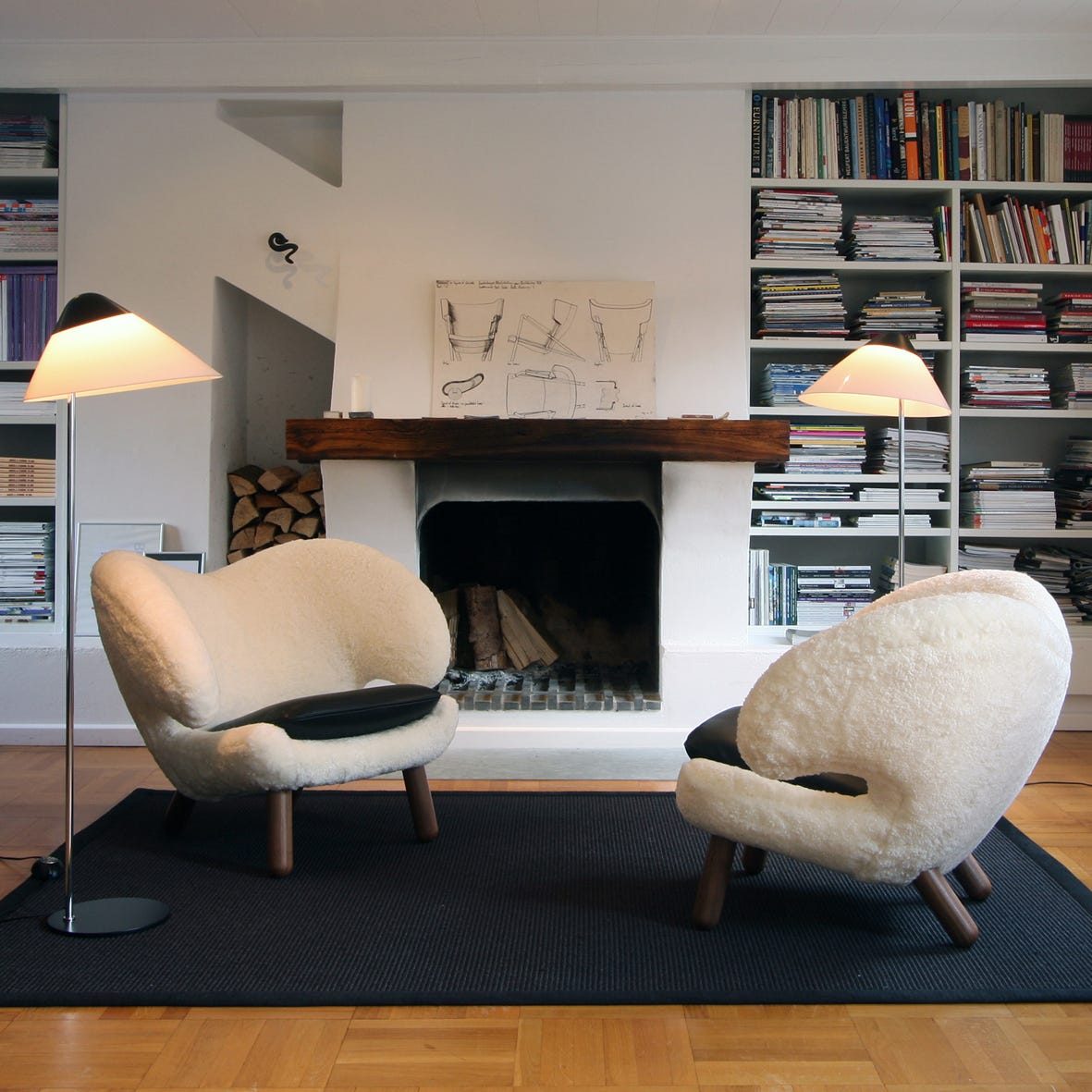
Object: Pelican chair
We love a chair at Design Lobster and this week I’m putting the spotlight on the so-called Pelican chair by Danish designer Finn Juhl. This was first shown in 1940 and caught people’s attention with its broad wing-like arms and sturdy legs. Reactions at the time were mixed – one writer in magazine Arkitekten said that the chairs "resemble more than anything tired walruses."
Finn was interested in Surrealist art and the strange anthropomorphic form of the chair betrays this influence. Reminiscent of a bird, it encompasses the sitter, somehow hugging them with its two arms. The chair’s construction was conventional, just an upholstered pine frame, but I love the way Finn leaves convention behind with the sculptural form that these standard elements take.
Design takeaway: Could you reimagine something conventional by pushing the boundaries of its form?
🛋 Finn Juhl built a beautiful house outside Copenhagen, filled with his own furniture.
Quote: “Form is everything.”
– Enzo Mari
A charming children’s puzzle carved from a single sheet of oak designed by Enzo Mari featured in Design Lobster #46. Enzo was famous for his bold experiments in form, pushing the boundaries of what a chair was in his Sof Sof (1972) and Box chairs (1971). This quote is an invitation to keep obsessing over the form that our designs take – there is often something surprising lying hidden that a design process can reveal.
Have a great week,
Ben 🦞
Enjoyed this week’s Design Lobster? Let me know by clicking the heart button.
👇


I wonder if banning SHOUTING IN CAPS could serve as a digital Toguna in online communities