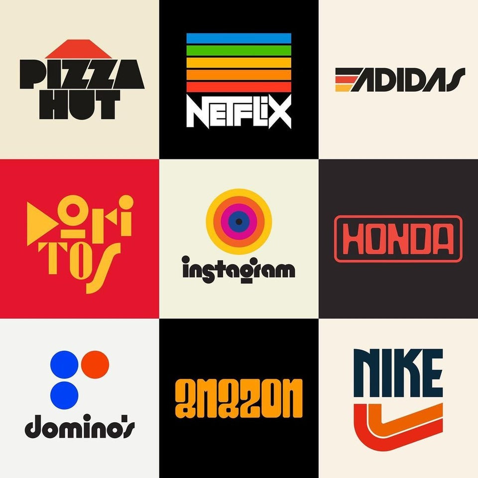
This week we’ve got a philosophical edition of Design Lobster🤔. We’re imagining a new kind of internet via the documentaries of Adam Curtis and exploring alternate histories via the logos of graphic designer Rafael Serra.
✨Enjoying Design Lobster? Please share it with a friend, colleague or fellow designer.
Question: How might the internet be a more progressive force?
My readers in the UK might already be familiar with the documentaries of Adam Curtis. His latest project Can’t Get You Out of My Head charts an “emotional history” of the 20th century over 5 hours of documentary footage intercut with his trademark narration and a thumping techno soundtrack. To try and understand some of the ideas in it better, I recently listened to this podcast with him, which contained the following quote:
The thing about the internet as a feedback system is that it can’t imagine something that hasn’t already happened. It’s always looking at patterns from the past. In a way it’s a sort of modern ghost story. What you get through your screen, suggested to you every day, are things based upon patterns of your own past behaviour, compared to the patterns of past behaviour of millions of other people... it traps you in that room, with those people, and it never offers you a door out of it. That’s its failing as it is presently constructed.
I still think that the internet could be constructed in another way and become a much more dynamic and progressive thing…
– Adam Curtis, documentary maker & cultural critic
I’ve been absorbed by the provocation posed by Adam here. It feels like a direct challenge to designers like me involved in creating internet products and services. In the general enthusiasm within the tech industry for gathering ever more data, the assumption that knowing something about somebody’s past allows you to predict their future is rarely challenged. It seems to me that by treating people as fixed clouds of data points we are missing so much about their goals and dreams as human beings, which if we knew, we could help them achieve. Perhaps, instead of algorithmic guesswork that dooms them to stay forever the same, we should ask people how we can help them progress.
Design takeaway: Is your design helping people progress?
✍️ If you’re in the UK you can catch Can’t Get You Out of My Head on iPlayer
Object: Reimagined Logos by Rafael Serra

This graphic design project caught my eye recently. Rafael Serra is a talented Portuguese type designer and in this series of images he posted on instagram, he conjures a mid-twentieth century world already populated with 21st century tech titans like Amazon and Instagram.
His designs have rightfully won plaudits for their graphic imagination. The typeface choices are impeccable and I personally love the range of off-whites he uses – somehow so perfectly of that era. Nevertheless it strikes me as a curiously nostalgic (perhaps even melancholic) project to propose alternate history where these companies have been around for half a century or more. In the vein of the quote from Adam Curtis above, I’d be more interested in a project that looks forwards, to imagine their replacements.
Design takeaway: Could you move your design forward by reimagining its past?
📷 Check out Rafael’s instagram here.
Quote: “The best way to complain is to make things.”
– James Murphy, LCD Soundsystem
This quote comes to us from the world of music, rather than design, but I think its message is equally powerful translated to a different domain. As designers, we have unique powers to transform our dissatisfaction with the way something works into a new solution. We should use them!
Whatever you do, keep making things.
Ben 🦞
Enjoyed this week’s Design Lobster? Let me know by clicking the heart button.
👇


