Happy Easter from Design Lobster 🐣. Today we’re admiring Florence Nightingale’s contribution to data viz plus an iconic egg-shaped chair. 🥚
✨Enjoying Design Lobster? Please share it with a friend, colleague or fellow designer.
Question: What was Florence Nightingale’s contribution to the field of data visualisation?

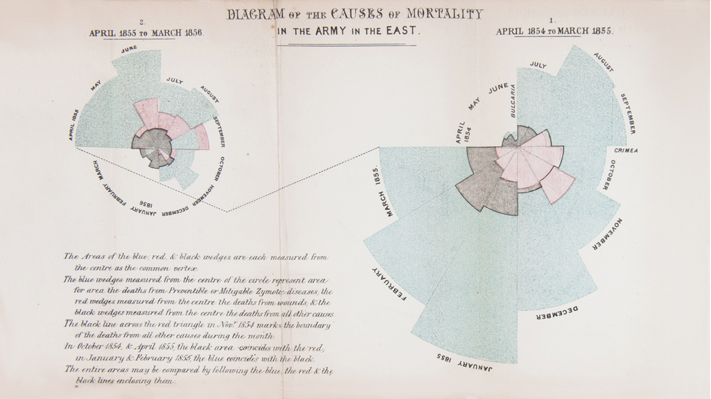
Florence Nightingale is well-known as a nurse, but not everyone knows that she also made an important contribution to data visualisation in the form of the Rose or Coxcomb Diagram, shown above.
During the Crimean War (1853-56) she instituted more rigorous hygiene practices in British field hospitals. These measures, that included hand washing and better ventilation, enormously reduced soldier deaths. However she had to find a way to communicate this to the British military establishment who believed that high numbers of deaths from disease were essentially unavoidable. The Rose diagram was born out of the need to show the before and after effect of her changes. On the larger rose to the right you can see the deaths up to her arrival in April 1855 – most of these were not from wounds or direct combat, but from preventable diseases like cholera contracted during service or hospital treatment. On the smaller rose to the left you can see the reduction once her new measures were in place.
Now, the Rose Diagram has its detractors, who argue it overcomplicates data that would be more clearly visualised by a bar chart. I tend to agree that it’s generally easier to understand a single dimension like the height rather than area. Nevertheless, I think the Rose diagram communicates the passage of time particularly well, resembling as it does the face of a clock. In fact I think the most confusing aspect of the two diagrams above is that the previous year is to the right. Given that we read from left to right in the West, you’d expect the earlier year to be on the left.
Design takeaway: What visual metaphors are you employing in your design?
🎧 99% Invisible released a great podcast last month about this story. Recommended.
Object: Egg chair by Arne Jacobsen
‘Tis the season for an egg or two so I thought I would share the story of the iconic Ægget or Egg Chair — designed by Danish designer Arne Jacobsen in the mid 1950’s. He had been commissioned by the SAS Royal Hotel in Copenhagen to design all parts of the interior – from furniture to cutlery – and he designed 50 of these chairs for the hotel lobby.
He explored the curvaceous egg-like shape in clay in his studio, which was then cast in single pieces of polyurethane foam for the final design. Reportedly, he took inspiration from Eero Sarinen’s 1948 Womb Chair which featured in Design Lobster #17. His choice of material meant the original chairs weighed only 7kg, which made them easy for staff to move around the lobby.
The chair is essentially a monocoque reinterpretation of a wingback chair, making it at once contemporary and part of a recognisable tradition. In the 19th century and earlier wing-back chairs would be placed by a fire where their shape helped shield an occupant from drafts. In Jacobsen’s reinterpretation – for the centrally-heated 1950’s – the shape has more of a psychological purpose, cocooning the sitter in a cosy leather or fabric bubble.
Design takeaway: How could your design reinterpret something more traditional?
🪑 Watch a short video about Arne’s work at the SAS Royal.
Quote: “Consistency is one of the most powerful usability principles: when things always behave the same, users don’t have to worry about what will happen.”
— Jakob Nielsen
A solid reminder from Jakob that designs should behave consistently so that people can know what to expect when they use them. Sometimes consistency gets misunderstood as just a visual thing, resulting in gaffes like Google’s near-identical set of icons. It’s behaviour where consistency really matters.
Whatever you do, do it consistently.
Ben 🦞
Enjoyed this week’s Design Lobster? Let me know by clicking the heart button.
👇


