It’s Design Lobster #48, here with some festive design stories to rouse you from your post-prandial slump. Today we’re exploring the history of the cracker and admiring a witty Christmas card by Milton Glaser. Happy holidays!🎄⛄️🎁
🦞 Enjoying Design Lobster? Do me a favour and share it with a friend, colleague or fellow designer. ❤️
Question: Why pull a cracker?
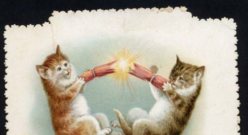
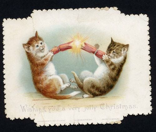
In 1840 confectioner Tom Smith was visiting Paris when he noticed the popularity of Bon-bons – a sweet consisting of a sugared almond wrapped in a twist of paper. Back in England he tried selling his own take on them, which included a love message wrapped around the sweet. However, dissatisfied with their commercial performance the story goes that while staring into the fire one evening and watching the logs crackle and pop, Tom had the brainwave to add an explosive silver fulminate banger to each one. Launched in 1846 as Bangs of Expectation, the design evolved to eventually eliminate the tissue paper for a more hardwearing cardboard design. The sweet too was over time replaced with a small gift or ‘surprise’ which in Victorian England ranged wildly. From hair dye and a wedding ring – in Smith’s Crackers for Spinsters – to tiny thermometers in ‘Nansen’ Crackers designed to celebrate the eponymous Norweigian explorer.
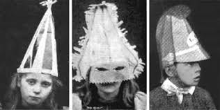
Tom’s son Walter came up with the idea of adding elaborate paper hats when he took over the business from his father. With a huge variety of ranges for every taste the cracker business became enormously successful. In 1891, the family company manufactured nearly eleven million crackers.
The evolution of the cracker shows how combining ideas from different disciplines – in this case confectionary and pyrotechnics – can lead to entirely new kinds of design. It’s also an example of designing explicitly for an emotional response. Crackers are one of the few mass-market products I can think of that set out to deliberately shock or surprise you as part of the experience of using them. Shock in particular is an emotional experience that has become much more associated with art in recent decades. Is it time we had more shocking design?
Design takeaway: Where might it make sense to add shock or surprise to your design?
🎧 Listen to a BBC podcast on the emergence of other Christmas traditions in the Victorian period.
Object: Milton Glaser Christmas Card
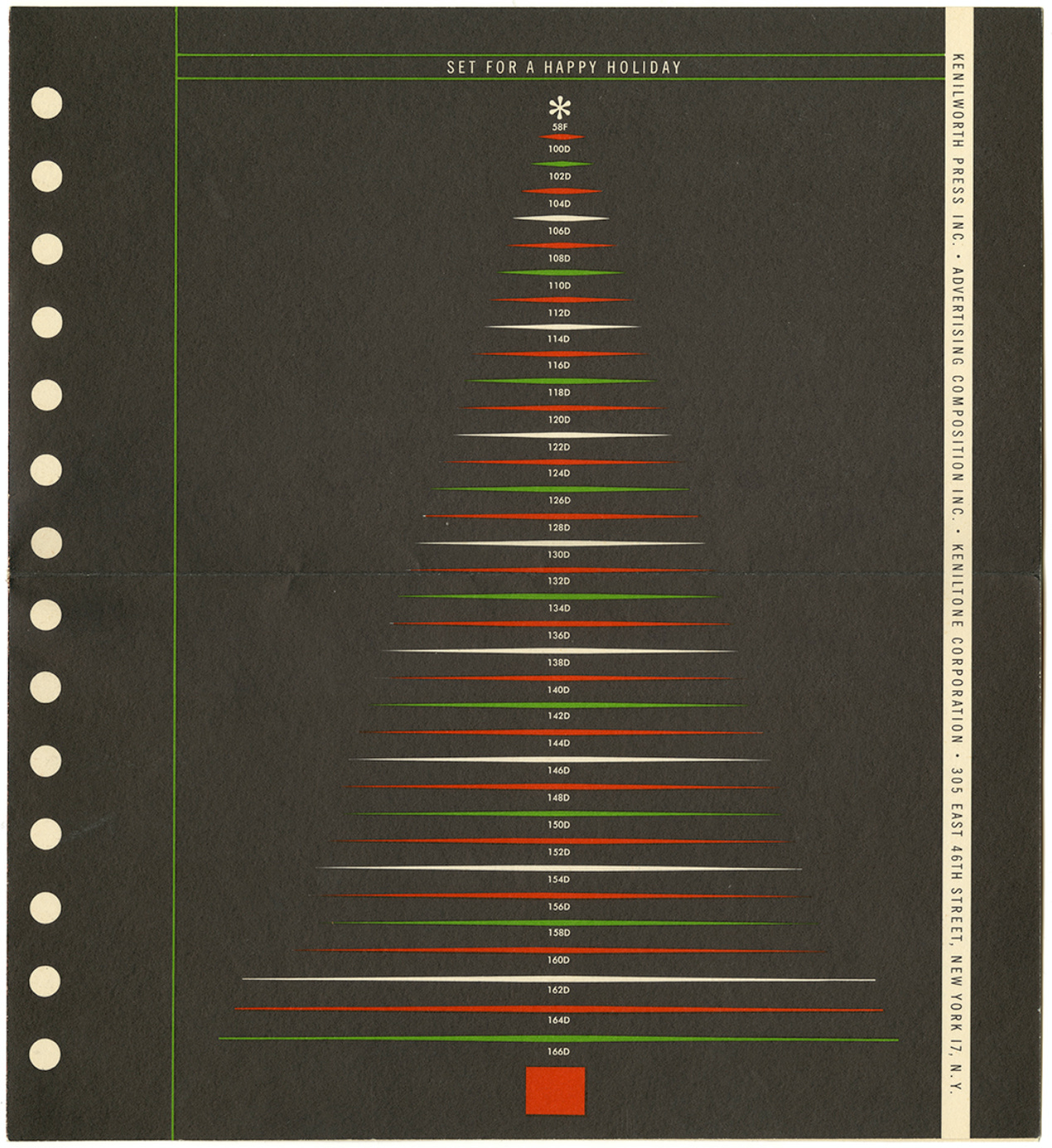
In the 1960’s Milton Glaser was briefed to design the Christmas card for typography company Advertising Composition Inc. It features the minimal silhouette of a Christmas tree created by a series of coloured bands. A number label for each layer makes up the trunk of the tree and an asterisk forms the star. The message ‘Set for a happy holiday’ alerts the viewer to the visual pun, which its turns out has borrowed codes from ACI’s own typesetting catalogue to compose all the elements of the festive tree.
There’s no doubt this card is an in-joke for designers working at a particular moment in the history of type. However, I think it also shows the designer’s skill at pulling together unrelated ideas or content and making them work together. This is a trivial example, but being able to find visual or intellectual connections between different types of information is, I would argue, a core design skill.
Design takeaway: What visual or intellectual connections does your design make?
✍️Peruse a selection of other delightful Christmas card designs by contemporary of Glaser, Paul Rand.
Quote: “People ignore design that ignores people.”
– Frank Chimero, designer and author of The Shape of Design
I’m a huge fan of Frank Chimero and this neatly symmetrical quote of his captures the reciprocal relationship between design and those served by it. If you want your design to be noticed and loved then you had better start noticing and showing some love to those for whom it is intended. As simple, really, as that.
Here’s to better designed 2021!
Ben 🦞
Enjoyed this week’s Design Lobster? Let me know by clicking the heart button.
👇


