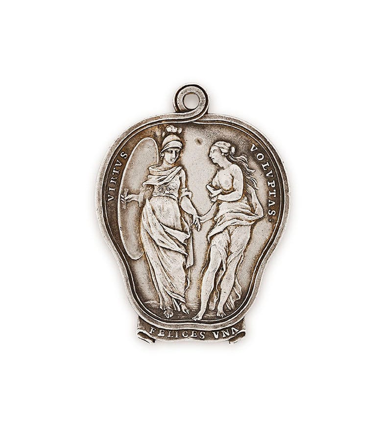
It’s Design Lobster #37 and I present to you a mooning gargoyle and a silver medallion. Something shiny, something rude 😜
By the way… I am taking part in the inaugural OnDeck Writer’s Fellowship over the next eight weeks. I’ll be thinking a lot about how to make Design Lobster better so keep an eye out for new stuff.
If you have thoughts on where you would like to see this newsletter go, please do get in touch with by leaving or comment or replying directly. I would love to hear your thoughts – good or bad. 🙏
🦞Enjoying Design Lobster? Please share it with a friend, colleague or fellow designer.
Question: How did Medieval stonemasons deal with difficult clients?

Difficult clients are a reality of working life, especially for designers. Unhelpful feedback, unreasonable demands and late payment of invoices may be wearily familiar to some of you.
I was inspired to discover how one Stonemason responded to low pay in the 13th century. He had been advised his final pay would be commensurate on the quality of his work and therefore slaved over the construction of the church at Glinton. However, when he was handed his final pay packet it was so far below his expectations that he felt insulted. In fury, he carved one last gargoyle, this time of a mooning man – their buttocks pointing directly towards their paymaster - the Archbishop at Peterborough Cathedral.
I won’t deny the idea is a little crude, but it certainly communicates a strong message!
Design takeaway: Could you turn a dispute with a client into a cheeky piece of design?
Get inspired for your next icon brief with this gallery of weird illuminated manuscript marginalia. 🏰
Object: Vauxhall Gardens Season Ticket
The Vauxhall Pleasure Garden was an 18th century park complex south of the River Thames in London. The gardens contained long avenues of trees for promenading, fountains, artificial ruins and a music pavilion where Handel regularly performed.
Entry in 1735 costed one shilling (around £12-15 today). However, the select few who had subscribed for a season ticket were awarded a silver medallion such as the one above, which they only had had to flash at the gate to be admitted. The medallions were designed by William Hogarth and feature the Latin caption Felices Una - ‘lucky one’. New designs came out each year to prevent fraud.
Credit card providers and banks have long understood the power that certain materials have to communicate prestige and exclusivity. In the present day, the durability and lustre of metal has lead to its use in American Express’ Platinum card and more recently in the challenger bank Revolut’s own range of metal cards.
As they did in 18th century England, the qualities of the material seduce the holder into believing something about themselves. Shiny things make us feel shiny too.
Design takeaway: How could you use materials (or graphics inspired by materials) to communicate with people?
A photoshop tutorial on how to turn any shape into shiny shiny chrome. ✨
Quote: “The details are not the details. They are the design.”
– Charles Eames
Charles Eames probably needs little introduction to many of those reading. He and his wife Ray were titans of mid-century American design, especially famous for their many varieties of plywood chair. You have probably sat on one of their creations, indeed, you might even be right now…
I identify with the sentiment of this quote – that you don’t really know the design until you know its details. For me, how a big idea gets translated into a set of details without compromise is the real job of design – the anguish and (hopefully) the triumph.
Keep discovering,
Ben 🦞
Has this email been forwarded? Sign up below to get the weekly emails delivered to you. ✏️


Love the mooning gargoyle :) The materials question made me think about how we work. In offices, 99% of surface materials that we touch and see are artificial. Even in this new Zoom world, we're looking at plastic and glass. I think the virtual backdrops showing nature in the background are actually helpful even if fake looking sometimes. But how much better would be enjoy work sitting on granite rocks listening to the sound of a river flowing by us.
Hey Mo, glad you liked the gargoyle! You raise a good point about artificial environments. There's a lot research about how exposure to nature improves our health - I think the millennial houseplant craze is related to this. I wonder whether that trend will go further and we'll see entirely natural work environments.