#34 When design makes us afraid
Welcome Design Lobster #34, this week we’re talking fear, computers and famous 20th century chairs. Don’t be scared. 👻
✨ Enjoying Design Lobster? Please share it with a friend, colleague or fellow designer.
Question: Why is fear sometimes part of the design brief?

I’m always interested in design that aims to transport us to different emotional states. Sometimes this power can be abused (see the crying bear in Design Lobster #30) but at other times it seems we positively desire to be taken to a place of discomfort, confusion or fear. I was intrigued to read about the Hongyagu bridge in Hebei province, China which when it opened in 2018, allowed pedestrians to cross a 500m-wide gorge on a transparent glass walkway. The bridge was engineered to have a slight wobble so that those crossing felt even more unsafe.
All of us are familiar with theme parks, which allow us to safely experience the wild rushes of adrenaline that high speed or danger release in our brains. This bridge seems to belong to this category rather than plain old civil engineering. I see it as an example of an ongoing trend of design becoming more and more like entertainment. From bridges to clothes and even software, it’s not enough for something to simply perform its function, instead we expect to be taken on an emotional journey.
The ironic postscript to the story of Hongyagu bridge is that it, and the other 23 glass-bottomed attractions in Hebei Province were shut last year owing to a report that questioned their safety. Fear, it seems, is not so fun when there is actually something to be afraid about.
Design takeaway: How could your design be more f̶r̶i̶g̶h̶t̶e̶n̶i̶n̶g̶ entertaining?
Watch a compilation of mobile phone footage from the bridge (warning, you may find this a little distressing!)
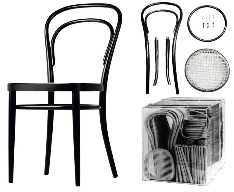
Object: Thonet Chair No. 14

An icon of industrial design, No. 14 came out in 1859 as the culmination of decades of research by Michael Thonet and his brothers into bentwood techniques. Rods of beechwood were wet or steamed in giant cast-iron presses over many hours in order to mould them into the shapes required. Once dried, only six large curved pieces, ten screws and two nuts were needed to build a chair, which could be done in factories with unskilled labour. Lightweight, hardwearing and inexpensive, by the year 1930 over 50 million had been produced, making the chair one of the first mass-produced designs.
"Never was a better and more elegant design and a more precisely crafted and practical item created."
— Le Corbusier
The Thonet No.14 chair is a great example of a design emerging from a rigorous investigation into how it will be manufactured. I really admire the condensing and clarifying instinct that Michael Thonet has, looking at things made from several pieces and asking whether they could be made from one. That drive to reduce complexity derives both the aesthetic quality of the chair and its potential to manufactured at such huge scale.
Design takeaway: What would it take for your design to be made from less components?
Watch the wood bending process (to a thumping techno soundtrack).
Quote: “Do what's good for humans, modeled on how humans already do things; ignore what's convenient for computers.”
– Stewart Brand,Editor of the Whole Earth Catalog
One for the digital designers among my readers. Though, not without its lessons for everyone. Stewart reminds us that our design work shouldn’t be driven by the capabilities or quirks of the technology we are deploying but instead rooted in the behaviour of human beings. A simple message, but one that can be hard to stay true to over the length of a project.
Keep discovering. 🦞
Has this email been forwarded? Sign up below to get the weekly emails delivered to you. ✏️

