#29 Mapwashing, hand pollinators and giving a sh*t
It’s Design Lobster #29 and we’re asking tough questions. When is participatory design just smoke and mirrors? Should humans really be doing the work of bees? Wear your most quizzical face and read on. 🤔
✨Enjoying Design Lobster? Please share with a friend, colleague or fellow designer.
Question: What is mapwashing?

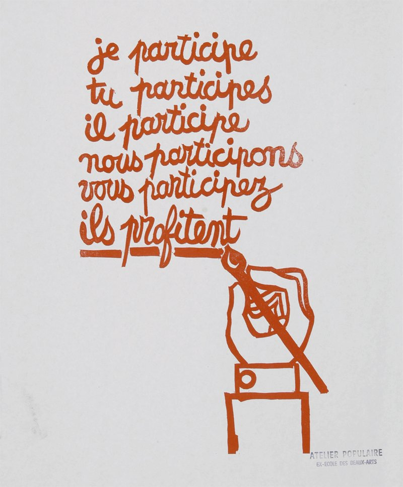
Student protest poster by Atelier Populaire, 1968
I recently read this long piece by Shannon Mattern that examines the participatory design processes used by Sidewalk Toronto, a Google-backed entity that had planned to transform a derelict stretch of Toronto shorefront into a new model of digitally-powered smart city. The project was highly controversial as it was unclear to what extent the significant street-level data collection envisaged would feed into the rest of Google’s online services. Suddenly in May this year, faced with mounting criticism, Google shelved the project entirely.
In her piece, Shannon coins the term mapwashing to describe the cynical use of the aesthetics of participatory planning (apps, maps and post-it notes) without any true intention to act on what that engagement uncovers. In her view, Sidewalk only invited participation on the superficial aspects of the design, deflecting attention away from the fundamental issues of privacy, justice and governance which were not up for discussion.
Many designers reading this will appreciate how valuable user engagement can be in evolving a design. We must be careful however that it is not being used disingenuously, as cover for more important decisions made without scrutiny elsewhere.
Design takeaway: How are you ensuring user participation in your design is more than just theatre?
Listen to a podcast on the Sidewalk Toronto controversy.
Object: Hand Pollinator

In Szechuan province in South-West China, habitat destruction and pesticide use have caused drastic falls in bee populations. Such is the decline that apple and pear farmers in Hanyuan Province have been forced to hand pollinate their orchards since the 90s.
Workers use long sticks with a small cluster of chicken feathers fixed at a right angle to reach up to the flowers and distribute pollen to the stamens. Because of the low cost of labour, this method has perversely become more cost effective than renting hives to do the same work.
These hand pollinators are a classic, if rather dystopian example of a kludge (see Design Lobster #25). Whilst I admire the tenacity of these farmers and their ingenuity at devising artificial means to replace lost biological processes, I can’t help but feel simultaneously appalled. Thrifty homemade design workarounds are having to fill a gap that poor policy has created and that’s not really something I can celebrate, no matter how much I love a kludge. 💔
Design takeaway: Is your design papering over a systemic problem?
Watch a video of the hand pollinators at work.
Quote: “Most startups aren’t competing with other startups; they’re competing with no one giving a shit.”
– Tom Blomfield, Founder of Monzo
Tom Blomfield delivering the harsh truth here that is much harder to design something people actually care about than something that looks nice and works well. Just because you have a beautiful (and usable) product, it doesn’t necessarily mean that people will find a use for it in their lives. Conversely, many a scrappy piece of design ends up being loved because it solves a genuine problem.
Keep discovering. 🦞
Has this email been forwarded? Sign up below to get the weekly emails delivered to you. ✏️


