#20 Fractals, f-holes and design morality
It’s Design Lobster #20. To celebrate reaching this milestone I’m giving away 20 limited edition Design Lobster facemasks to the next 20 people to sign up. If you have a friend or colleague that you think would enjoy these weekly emails, now’s the time to get them to sign up so they can start things off stylishly with a free gift.
Forward this email or click on the button below to share. I’ll be contacting the first 20 new email sign ups to ask where to post their facemask to. 🦞

And now on to this week’s email, with has a shape theme, shapes that organise space or amplify waves of sound. 🔵🔺🔸
Question: What if we didn’t use perspective to organise space?

Above: (left) a nautilus shell, (centre) an aerial view of the Sultan’s palace of Logone-Birni in Cameroon, (right) a plan showing the spiralling route to the throne room.
In the Western architectural tradition perspective has come to dominate how we think about organising space. The characteristic lines of a perspective drawing that extend continuously towards a horizon allowed us to visualise and design the cathedrals and palaces of Europe. On an urban scale the technique resulted in the avenues and grids of Paris and most American cities.
But this development was not inevitable. In many design traditions on the continent of Africa, fractals are used to organise space instead. Fractals are geometric patterns that repeat on ever-shrinking scales. They are self-similar, so that a given part looks like the whole. Frequently occurring in nature they are found in things like ferns, shells and even human lungs.
Because of the way they become steadily smaller and more complex, they have been used by African designers to create powerful spatial sequences. In the example above at the Sultan’s palace of Logone-Birni palace in Cameroon, the decreasing scale of the rooms in the spiral communicates the greater politeness required of guests as they approach the throne.
Design takeaway: How could your design use fractal patterns to communicate meaning?
For further reading, this book by Ron Eglash is a good start.
Object: Violin F-holes

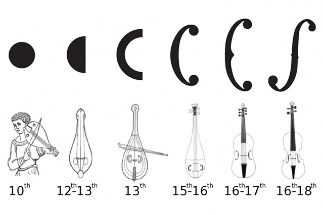
Above: the development of the sound-hole.
The sound-holes of the fithele – a Medieval ancestor of the violin – were circular. Over the course of many centuries, they became C-shaped and then F-shaped as the modern violin was perfected in the workshops of Cremona in the 16th and 17th centuries. A slow process of iteration led by the intuition of generations of craftsmen as they built and then listened to the sound their instruments made.
In 2015 a team at MIT were able to prove scientifically why the f-hole is so superior at amplifying sound compared to a simple circle. The key variable is the length of the periphery of the hole rather than the size of its area. Because it has so much more peripheral length the f-hole shape pushes roughly twice the amount air through it making the sound much louder and richer.
Incredibly the shape of an f-hole is exactly that of a flattened sphere. If you imagine carefully unpeeling an orange and laying it out, it would form the same shape 🤯.
Design takeaway: How could you iterate the shape of your design so that it performs better?
Watch a video about f-holes (features two clementines being peeled)
Quote: “Every technological artefact that is used will mediate human actions, and every act of design therefore helps to constitute specific moral practices.”
– Peter-Paul Verbeek, Philosopher of Technology at the University of Twente
In this quote Peter-Paul reminds us that every act of design, no matter how trivial, has an ethical dimension. His concept of ethics by other means describes the way that even though designers or engineers might not be directly involved in a situation, our work nonetheless helps to shape human actions. Whether we like it or not we are embedded in the ethical question of how our users should act and implicated in the decisions that they make.
Keep discovering. 🦞
Has this email been forwarded? Sign up below to get the weekly emails delivered to you. ✏️

