#15 Ink traps, Olympic posters and limitless creativity
Welcome to Design Lobster #15. What a week. Alas Covid—19 seems to have paid a visit to Design Lobster HQ so I have been quite under the weather. I hope that you are staying healthy and well. 🌈
Question: What is an ink trap?

How does the font above look to you? Something not quite right? This is Bell Centennial, designed by Matthew Carter for AT&T in the 1970s. This typeface, and others like it, are designed to preserve legibility even when printed at high speed, on low quality paper and at tiny sizes. They do so by using small cut-outs in the letter forms that ‘trap’ excess ink and prevent it from spreading just anywhere on the paper.
For me, these little notches reveal something quite poetic about type as a kind of irrigation system for fluid ink, a reminder that this is (or was) a liquid medium. But the design choices also make them much more robust – no matter how imperfect the printing conditions are you’ll be able to read them. In fact, they actually look best when the paper is cheap and the printing hurried.
With physical printing in decline, one might expect to see font faces with ink traps falling out of use, but instead they are having a a second life based on their rather unusual aesthetic qualities. UK music startup Mixcloud, for example, used them in their recent logo redesign.
Design takeaway: What small change could you make to your design to make it work better in adverse conditions?
Some contemporary fonts that use ink traps.
Object: Tokyo Olympics 1964 Poster

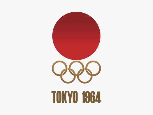
None of us will be travelling this year to Tokyo for the Olympic games sadly, but I’ve been getting some substitute thrills from learning about the poster that was designed for the last time Japan hosted the Summer Games. It was designed by Art Director Masaru Katsumi and Graphic Designer Kamekura Yusaka and depicts a bold red Hinomaru (circle of the sun, 日の丸) rising above the five gold Olympic rings. Beneath them, in bold Helvetica, simply the city and the year.
It’s a harmoniously minimalist solution that makes a powerful visual connection between Japan’s flag and the iconography of the Games. For all its elegance however, those connections have not been without controversy. The Hinomaru had powerful wartime associations, indeed during the Allied occupation of Japan after WWII its public display was actively suppressed. Its presence on the Olympic poster was evidence of both a resurgent nationalism and an attempt to rehabilitate these national symbols to represent peace rather than war.
Designers beware. Context is everything. Even a shape as simple as a circle can harbour dark secrets.
Design takeaway: Are there shapes in your design work that may have an unintended meaning?
Legendary designer Milton Glaser rates every single Olympics poster here. Spoiler: this one gets top marks.
Quote: “You can’t use up creativity.”
– Maya Angelou
A quote this week from a writer rather than a designer, but one that has a positive message for anyone doing creative work. Creativity, unlike other resources that we rely on, is entirely renewable. As long as you’ve got energy, the right problem and the right environment to work on it, you can be sure this particular spring will never run dry. Something hopeful in that.
Keep creating. 🦞
Enjoyed this week’s newsletter? Share it with a friend, loved one or fellow designer. 🤓
Has this email been forwarded? Sign up below to get the weekly emails delivered to you. ✏️


