


#124 Design Symbols
Play buttons, swooshes and more ♐️
Welcome! This week we’re sleuthing the origins of some everyday design symbols. Have you ever wondered why we tap a triangle to play a song, or the meaning of Nike’s iconic ‘swoosh’ logo? This week’s Design Lobster has got you covered 🕵️♀️
This will be the last regular edition of Design Lobster for 2022, though I will also be sending out a roundup of some of the most interesting design ideas we’ve encountered over the past year to tide you over the festive break. Thanks to all 2,500 of you for your support this year – excited to dive into more weird and wonderful design together in 2023 🎇
✨Enjoying Design Lobster? Share some the design love with a friend, colleague or fellow designer.
Question: Why do we press a triangle when we want to play something?

Some symbols of modern life are so ubiquitous that the question of their origin never even occurs to us. One such mystery, hidden in plain sight as it were, is the fact that a right-facing triangle has become the universal sign for “play”.
Reportedly, this convention dates to the 1960s during the early days of tape players. The triangle symbol pointed in the direction the magnetic tape moved across the play head, and thus the symbol communicated what would physically happen to the tape whilst it played. All of the secondary symbols associated with playing media fell out of this initial choice – double arrows for fast-forward or rewind for example and an empty square box (without a triangle) for stop.
Cassette players are long since obsolete, but the physical metaphor that the play arrow represents has endured in a purely symbolic form. It’s sheer universality makes it hard to imagine an alternative symbol ever replacing it.
Special mention to reader Aris, who mentioned this in the office and ignited my curiosity to find out the answer!
Design takeaway: What symbols does your design rely on to communicate how it works?
▶️ In Design Lobster #116 we explored another ubiquitous example of design - the QWERTY keyboard
Object: Nike ‘swoosh’

Nike’s celebrated swoosh logo was designed in 1971 by Carolyn Davidson, then a graphic design student at Portland State University. Nike’s co-founder, Phil Knight, who was teaching an accountancy class at the university at that time, allegedly approached Davidson and asked her to design a logo for the brand. A big fan of the Adidas stripes, Knight’s initial brief was to design a new kind of stripe for a shoe that represented movement.
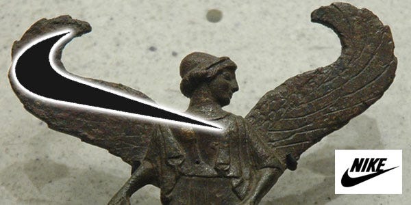
Davidson came up with five different designs, including the swoosh, which was inspired by the shape of the wings of the goddess Nike, the Ancient Greek goddess of victory. You can see in the image below how the curlicues of each wing were transformed into the shorter flicked end of the Nike logo.
Knight was initially rather cool on the design and paid her just $35 for her work, but later gave her a further compensation in the form of a swoosh-shaped gold ring and an undisclosed amount of stock in the company. Since then though, the swoosh has become an iconic symbol of the Nike brand. Featured on all of the company's products, it communicates company values like high performance and athleticism through a simple but highly memorable shape.
Design takeaway: How could you succinctly represent the values of your design through a symbol?
📹 Watch Fast Company’s history of Nike in 3 minutes
Quote: “A symbol, in its simplest form, is an object that stands for another object, giving it an arbitrary association. In this way, a symbol is a sign that has acquired a conventional meaning through habitual use.”
– Paul Rand
One of the luminaries of graphic design gives us an especially clear definition of a symbol here. It touches on an aspect of design that has always fascinated me – how objects accumulate meaning through the way we use them.
Have a festive week!
Ben 🦞
Enjoyed this week’s Design Lobster? Let me know by clicking the heart button ❤️
👇
Fascinating! The "play" button makes me think of the floppy disk "save" button as well.