Welcome! This week’s Design Lobster is an airy affair. We’re examining the gravity-defying physics in one of Dyson’s latest products and learning about an IKEA inflatable from the 1990’s. Take off any high-heeled shoes and dive right in 💨
This week I want to give a shout-out to a newsletter called SatPost which I’ve been enjoying recently. It’s written by Trung Phan and has a unique and irreverent take on business, technology, art and design. I particularly enjoyed this deep-dive into the theatricality of Apple packaging 👀
Question: What is the Coanda effect?
My attention was caught recently by a Dyson product release, this time for a new kind of combined hairdryer and curling iron called the Airwrap. Alas I don’t have anything like enough hair to think about curling mine, but even so I found myself mesmerised by videos of hair wrapping itself around the device as if by magic, then springing away in a mass of newly-formed curls.
The Coanda Effect describes the tendency of airs or liquids to cling to a nearby surface. It’s the reason why pouring cream from a jug often leads to it dribbling down the side onto the tablecloth, rather than hitting your bowl. The Airwrap uses this effect to “curve” air around the barrel so that when hair is placed nearby it automatically slides around it to form a curl, instead of needing to twist the iron yourself. Dyson also claim this effect means that less heat is needed to fix the curl too, which is better for overall hair health.
Dyson are masters of marketing the advanced technology that they put into their products, to the point that it feels legitimate to wonder whether at least some of the jets and cyclones they talk about on their product pages might be just for show. But the popularity of the Airwrap – sold out for much of the past year – would seem, in this case, to prove the cynics wrong.
Design takeaway: What laws of physics does your design harness?
💁♀️ Watch a video of the Airwrap in action
Object: IKEA a.i.r. series
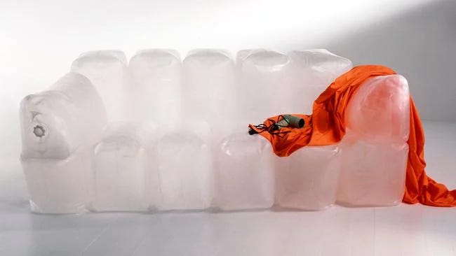
It’s not difficult to understand why Ingvar Kamprad – then CEO of IKEA – got so excited when designer Jan Dranger showed him a prototype of an inflatable sofa in the mid 90s. With its ultra-lightweight design that was easy to transport and set up, the idea seemed perfectly in sync with IKEA’s five key principles; form, function, quality, sustainability, and a low price.
The IKEA a.i.r. series went on sale in 1997, including the Innerlig sofa shown above and an easy chair called Rolig. However it quickly became apparent that the blow-up utopia promised by this new furniture was not going to appear. There were practical issues like the tendency of dust to cling to the plastic and the leakiness of the seal that would leave the sofa a deflated hulk after just a few days. Designed to be blown up with cold air from a hairdryer, people’s unfortunate tendency to use hot air meant the seal might even melt completely.
But beyond this, there were big issues with what the furniture was like to use. Because of it’s lightness, it had a tendency to drift awkwardly around the room. Even worse were the noises it made when people sat down on it or adjusted their position.
Whenever I’m pondering the design of a piece of furniture I always go back to Joseph Rykwert’s essay The Sitting Position – A Question of Method which reminds us that the emotional and symbolic factors of a design demand as much consideration as the practical ones. Ultimately, no one wants to be embarrassed by their chair!
Design takeaway: Are you considering emotional and symbolic factors in your design?
💨 Before the a.i.r sofa, Quasar Khanh’s 1960’s aerospace series was the original inflatable furniture flex
Quote: “Whitespace is like air – it is necessary for design to breathe.”
– Wojciech Zieliński
A quote from the world of graphic design this week, reminding us the vital role that negative space plays in design. If you notice your layout, plan or composition doesn’t seem to be working too well, try giving the elements in it a little more breathing space.
Hope you float through this week 🌬
Ben 🦞
Enjoyed this week’s Design Lobster? Let me know by clicking the heart button ❤️
👇


The fatal flaw for me is that you need hair :D
As someone who designs both graphic art, essays, and music I second the importance of “whitespace”. In music it is called headroom, separation, or spatiality. Cram too much into a song or recording and it buries the desired effect. Music must breathe. Graphic design must also breathe. Essays must breathe in overall design & typesetting . They must also breathe within the logic & language employed to argue the points. There is a fine art to each of these.