This week’s Design Lobster is buzzing with weird and wonderful stories from the world of design. We’ll be exploring the technological transformation of the filament bulb and admiring a 1950’s electric heater with a revolutionary modernist silhouette. It’s a crack(l)er. 🔌
✨Enjoying Design Lobster? Please share it with a friend, colleague or fellow designer.
Question: Why are filament bulbs everywhere these days?
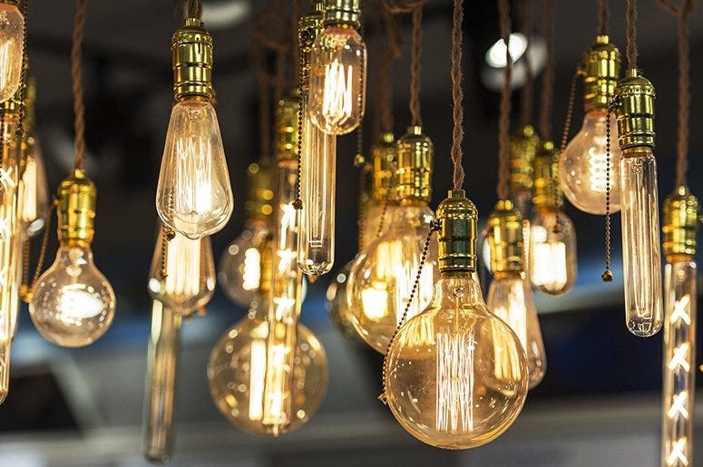
These days, no self-respecting hipster café in New York, London or Tokyo is seen without a cluster of hanging bulbs, preferably sporting a trendy patterned or braided fabric flex around the wire. To the casual observer, these bulbs wouldn’t look out of place in the 19th century, their looped or coiled filaments seemingly made of good old-fashioned carbon or tungsten.
In fact though, these vintage-looking lights use modern LED (light emitting diode) technology to produce light. Rather than a glowing strip of metal, each filament is made up of a string of hundreds of tiny LEDs on a transparent glass substrate, fixed in resin and tinted with phosphor to warm the colour of the light they emit. Correspondingly these bulbs are vastly more efficient, the equivalent of a 60W bulb will use only about 10W and last for years rather than months.
This dramatic step-up in efficiency is part of the reason for the ubiquity of these bulbs. Governments have been legislating bans of old filament bulbs, and consumers have been upgrading anyway to save money on bills. But LED bulbs come in all shapes and sizes, and the special popularity of the filament type is in my opinion much more culturally driven. What we might be seeing is an example of Raymond Loewy’s MAYA Principle in action. This idea, that people choose designs that are the Most Advanced, Yet Acceptable would suggest these retro-looking bulbs are a comfortable stepping stone into the brave new world of LED lighting.
Design takeaway: How could you reference something familiar to make people feel more at ease with your design?
💡 Learn more about the invention of the original filament lightbulb
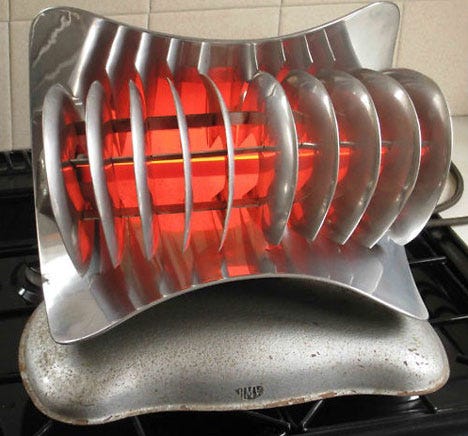
Object: HMV Lincoln electric fire
This rather sci-fi looking heater went on sale in Britain in 1955. Electric heaters were still a relatively new category at the time, and the design of competitor products was much more conservative – variations on a cabinet with a grille that would retire into the background of a room. With the Lincoln however, the designers took a very different approach, emphasising the newness of the technology with a sculptural all-metal design. Though the fins have a functional role in helping to radiate heat, their streamlined profile recalls jet engines and automobiles instead of domestic objects and serves to make the heater highly distinctive.
How are we to create this demand for electric heaters? First we must improve their design until they impress by their very appearance—they must simbolize [sic] electricity.
— Curwen, A. Electrical Review. (1934)
This quote, which I read in Adrien Forty’s book Objects of Desire captures the challenge that faced these designers, and which continues to face us in different forms today: how to communicate ideas and values through appearance. In this instance, the designers used industrial materials and shapes to stir excitement about the new technology of electricity. What symbolic power do your design choices have?
Design takeaway: What does the appearance of your design communicate?
✈️ We explored a similarly streamlined pencil-sharpener in Design Lobster #104
Quote: “Design is inherently optimistic. That is its power.”
– William McDonough, architect
A quote this week to charge you up from architect and pioneer of Cradle-to-cradle design, William McDonough. Because the design process is always oriented towards solving problems and imagining new and better futures, it is in this sense fundamentally optimistic as a discipline.
Have a great week,
Ben 🦞
Enjoyed this week’s Design Lobster? Let me know by clicking the heart button ❤️
👇


